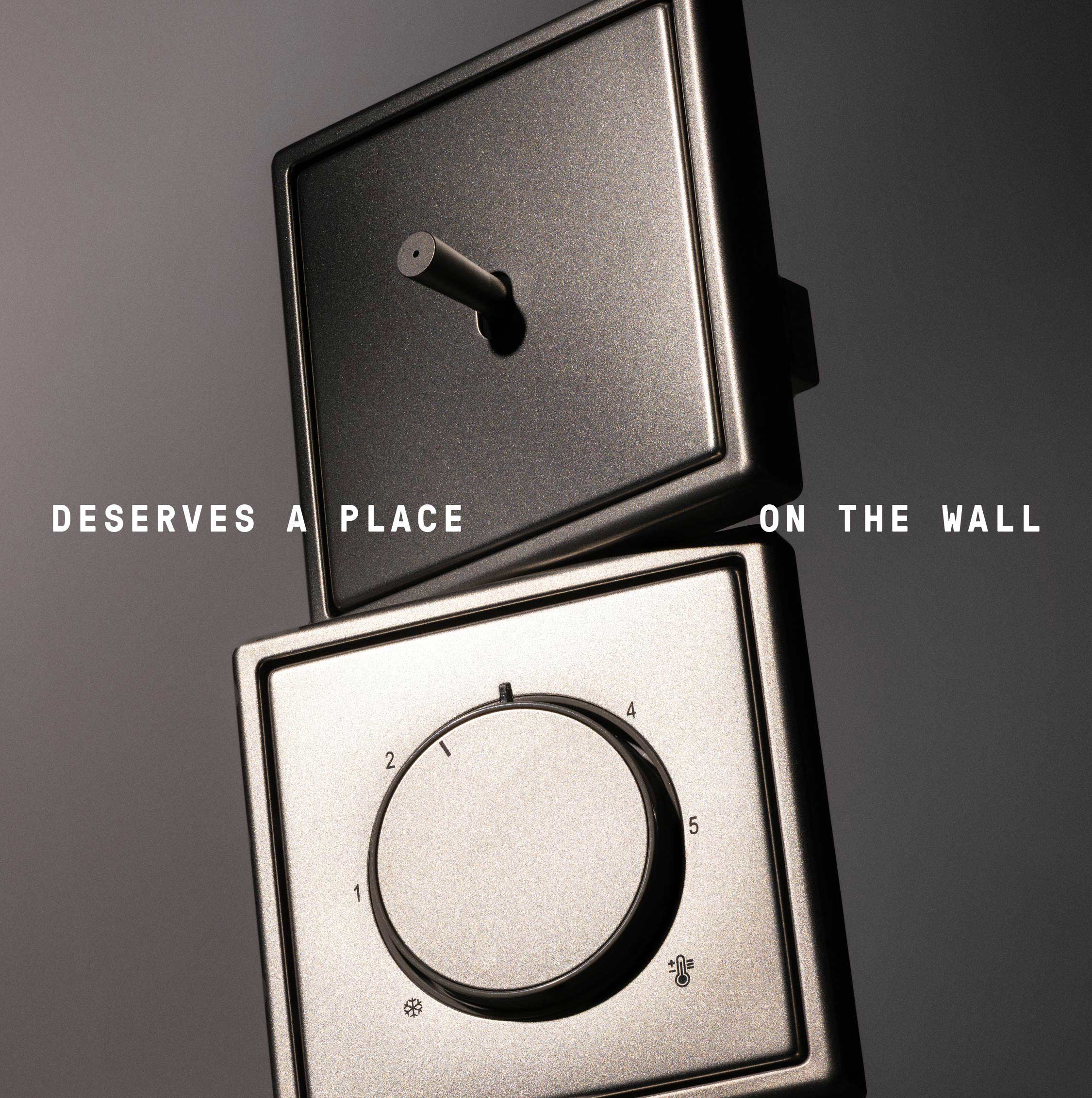
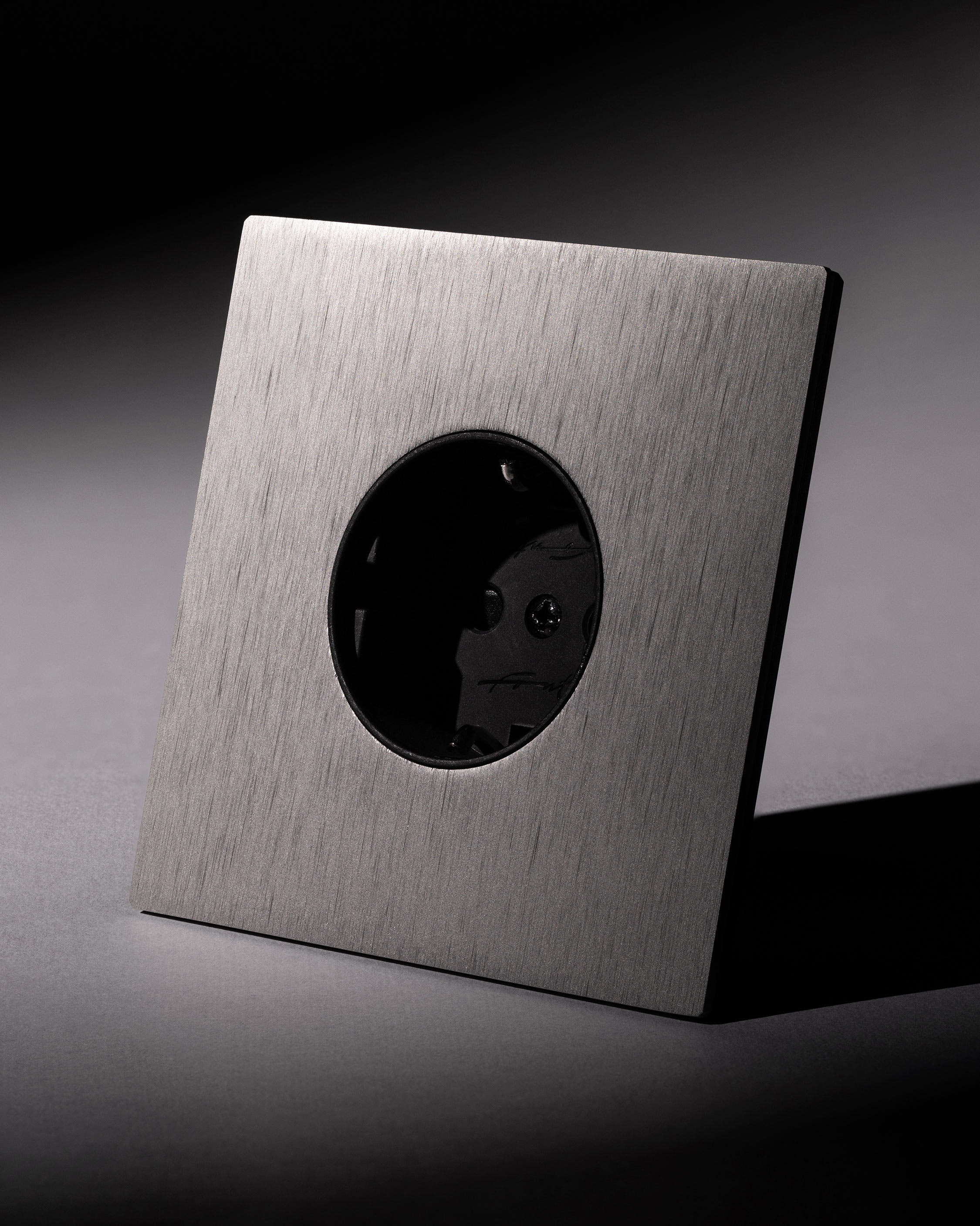
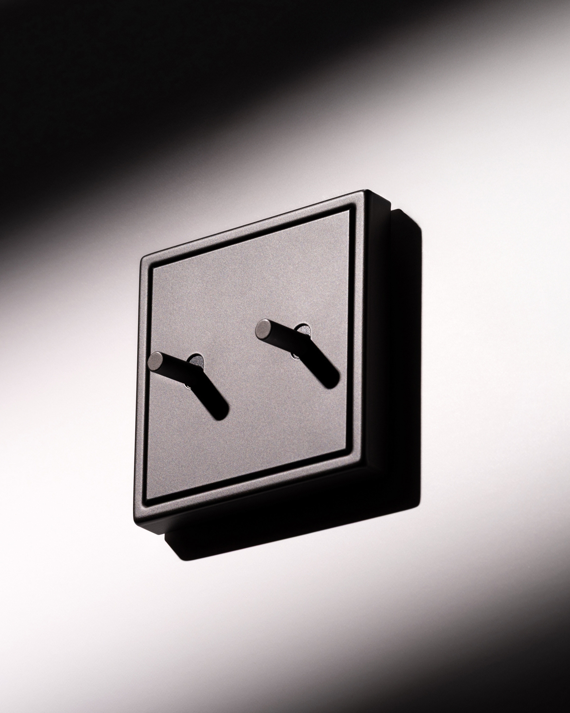
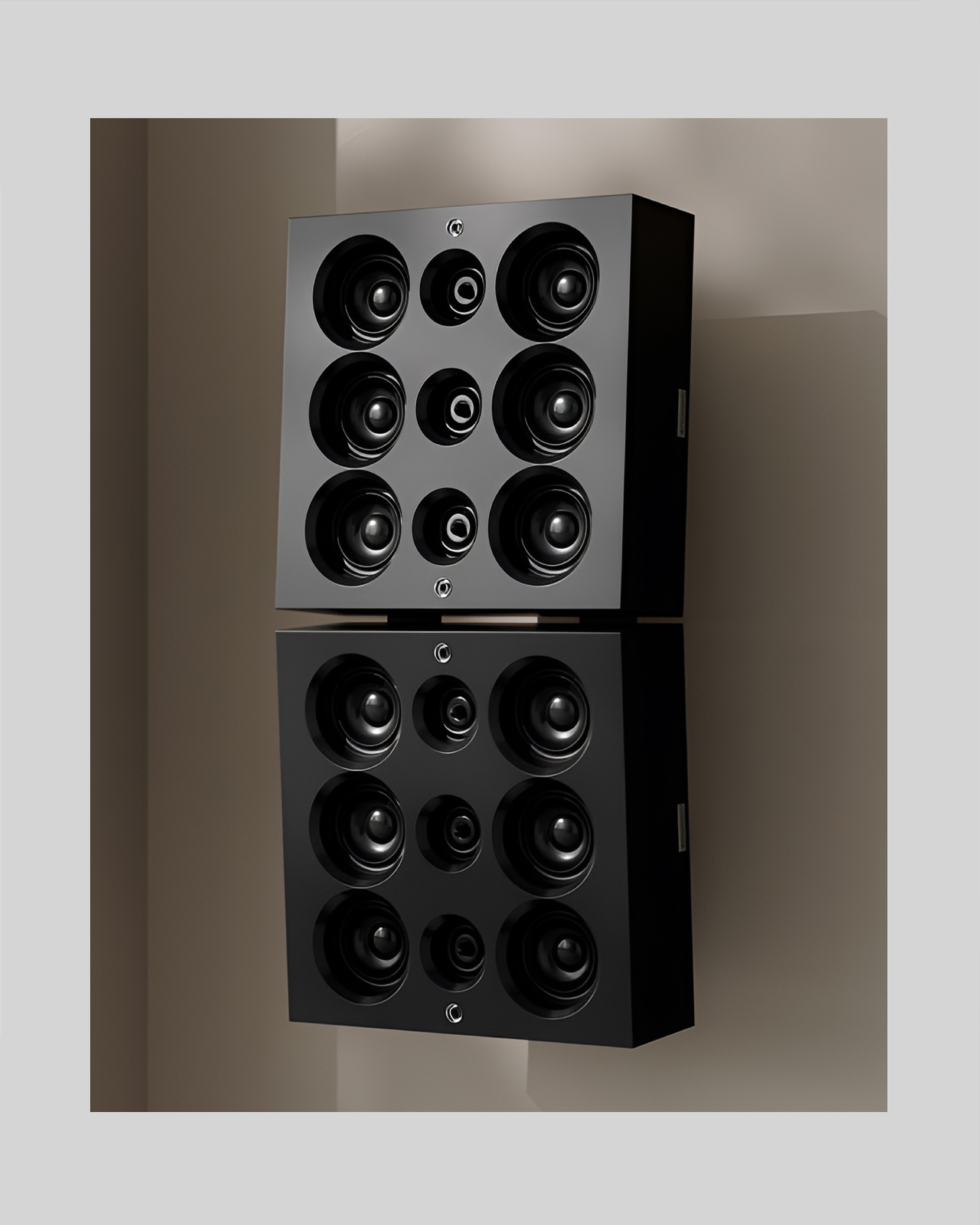
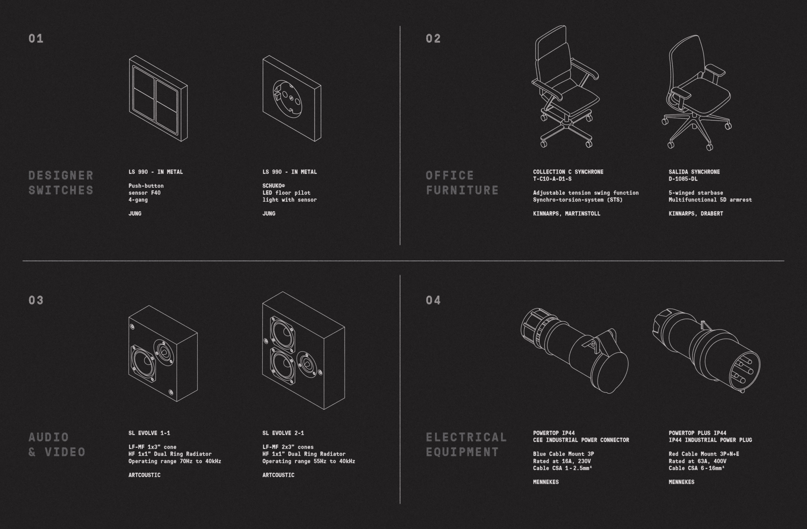
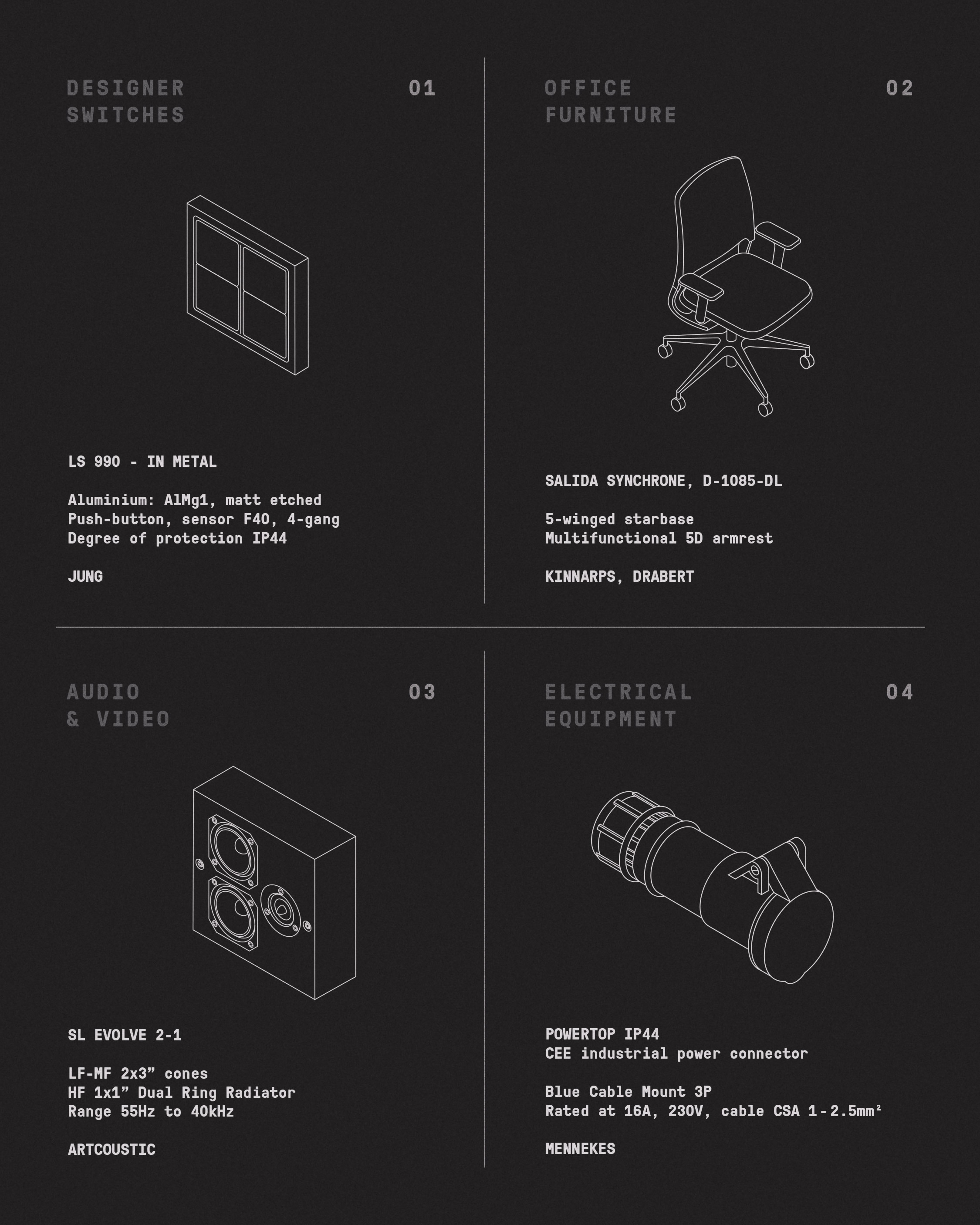
When tasked with naming and designing the visual identity for this multibrand concept store and showroom, the main challenge was creating something compatible with many different segments and brands it offers – electrical components, office furniture and sophisticated audio equipment.
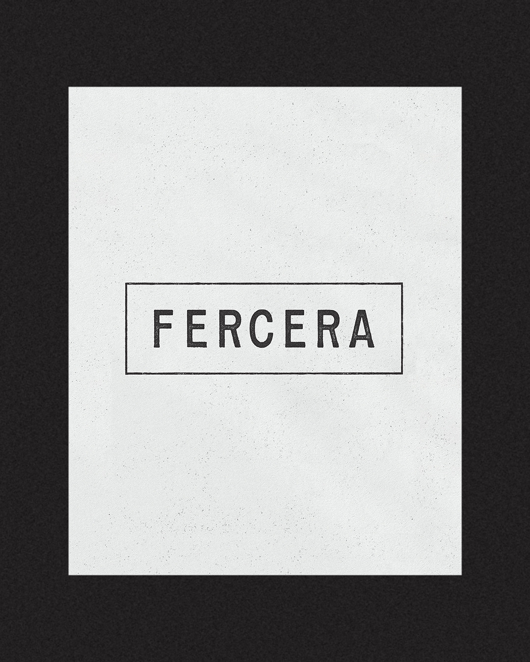


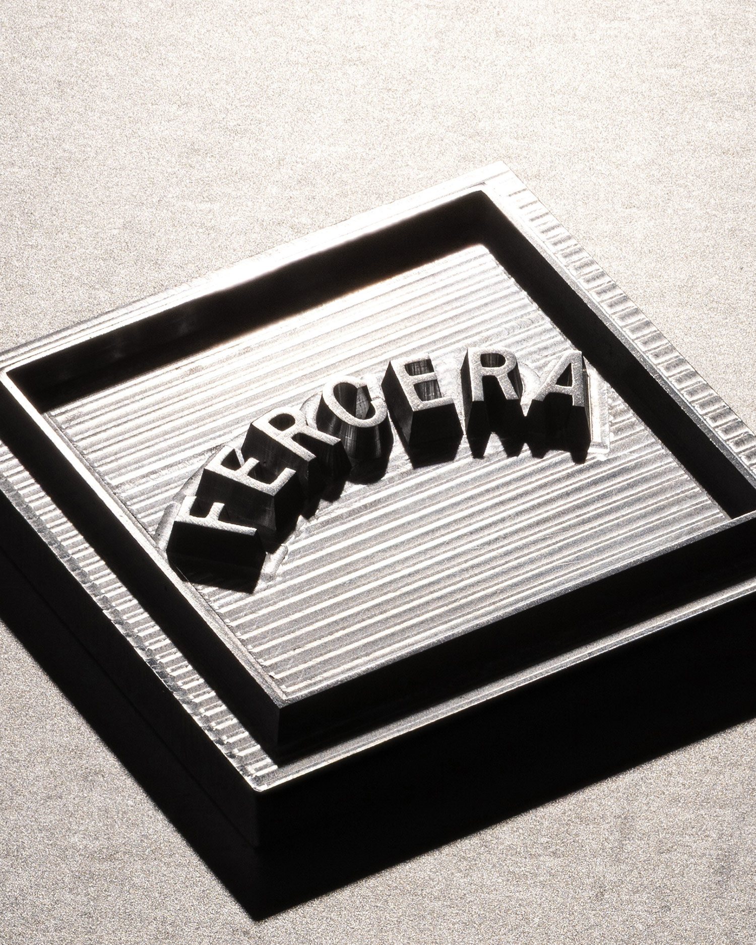
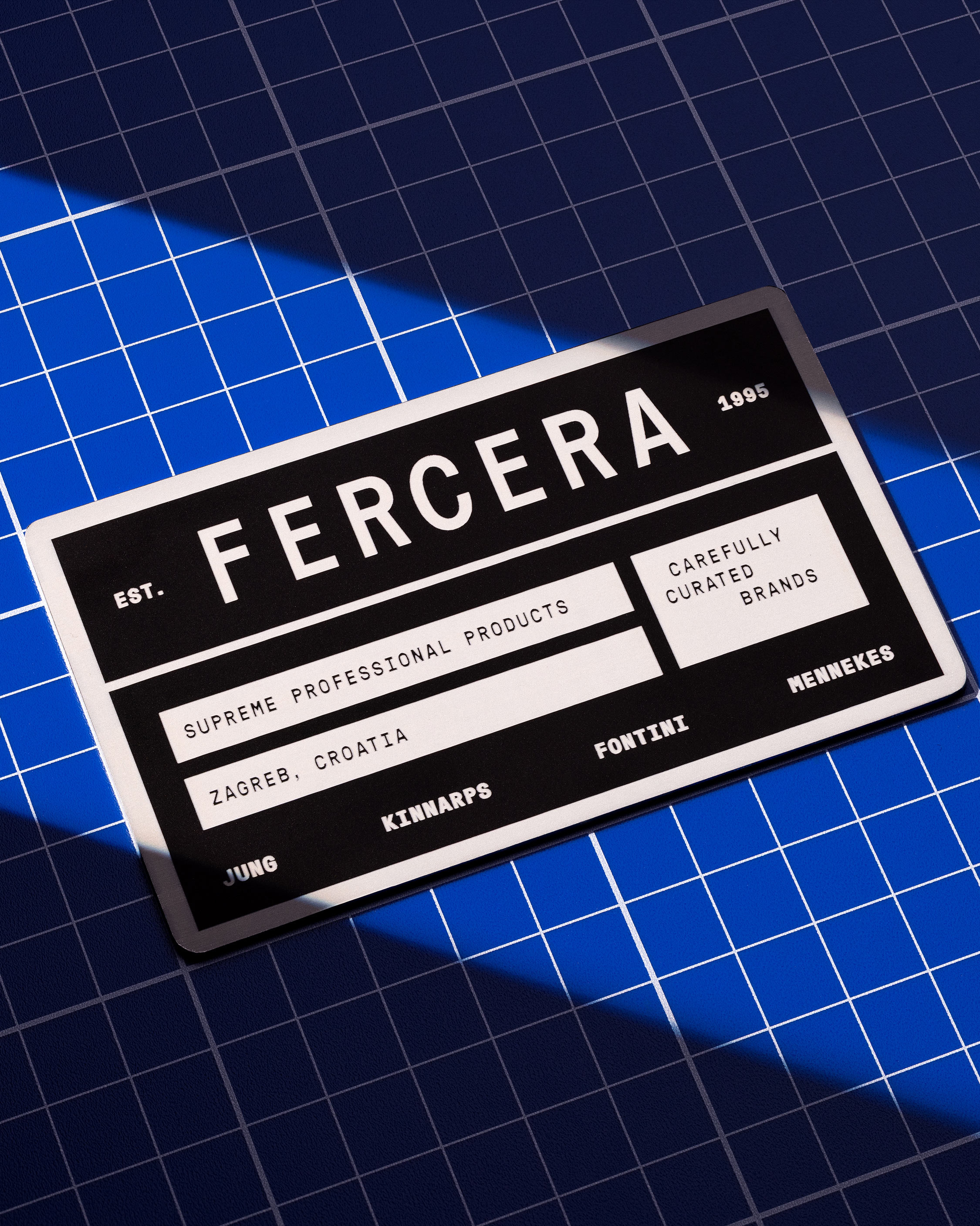
The name probably means nothing to you since you’re not from Croatia, but if you by any chance were, you’d be familiar with it. Fercera means that something “functions properly” or “works smoothly.”
“Sve fercera” therefore means that “everything works”, a colloquial expression that mechanics, electricians, construction workers and engineers frequently use when they successfully manage to make something do what it’s supposed to.


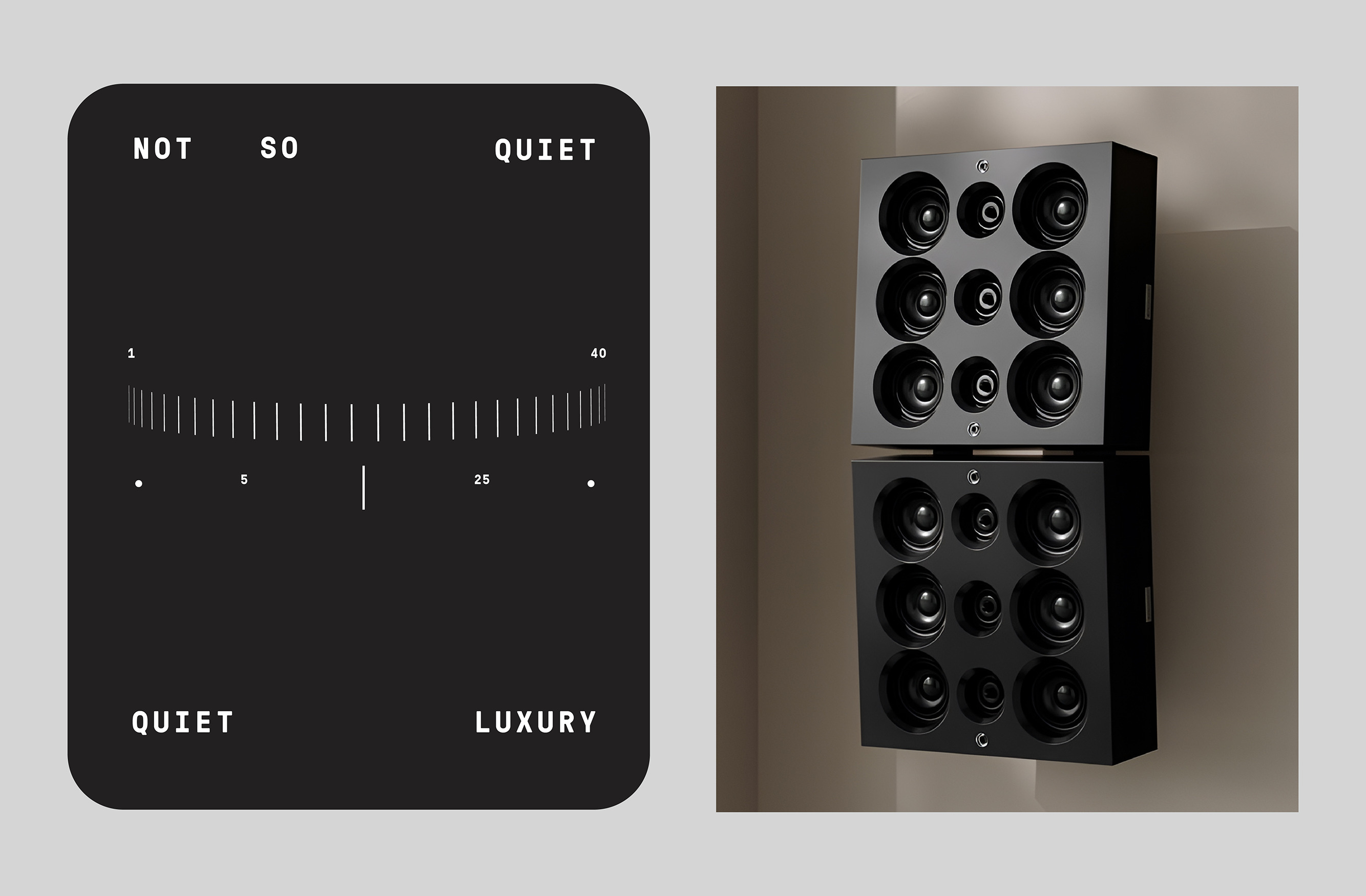

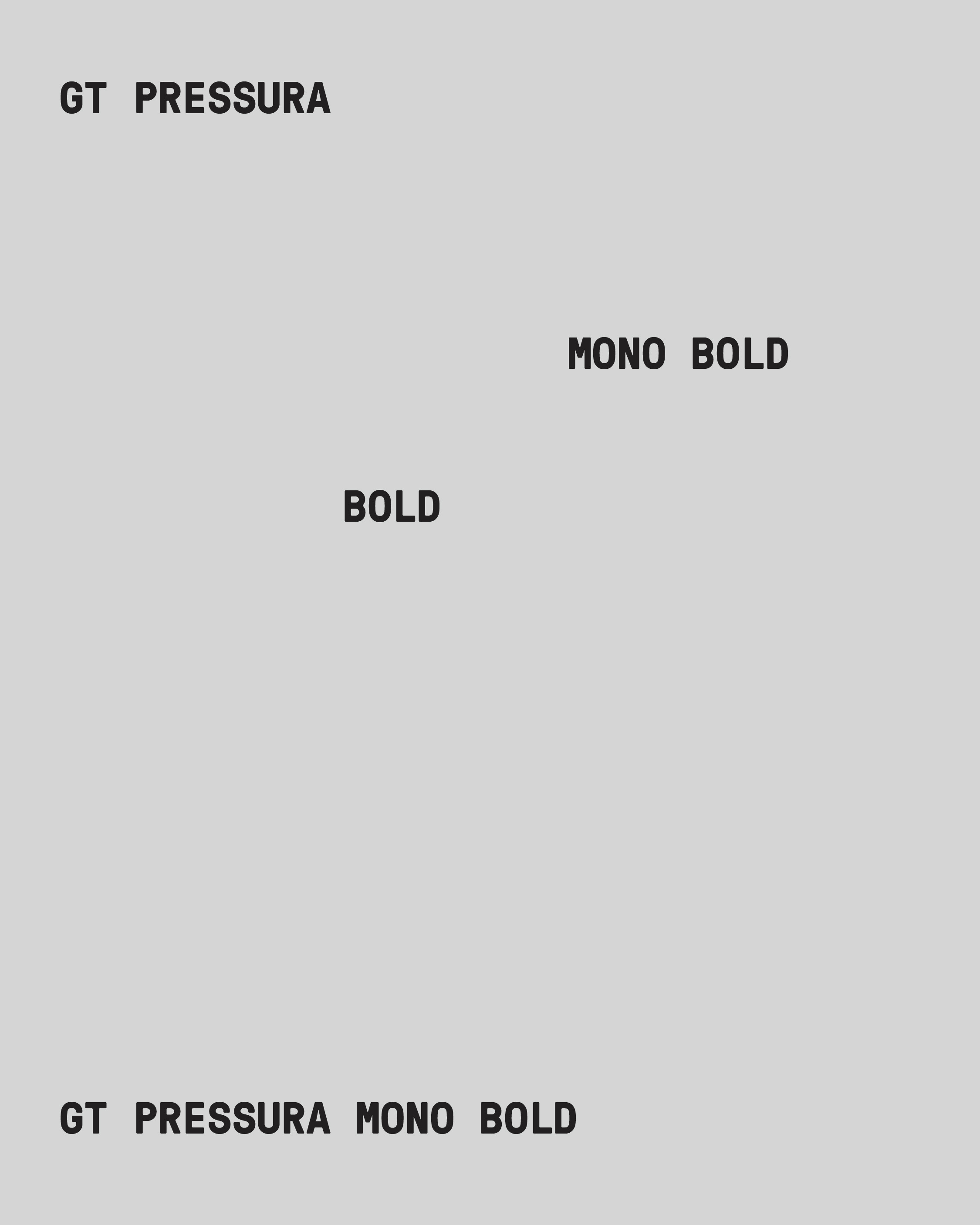
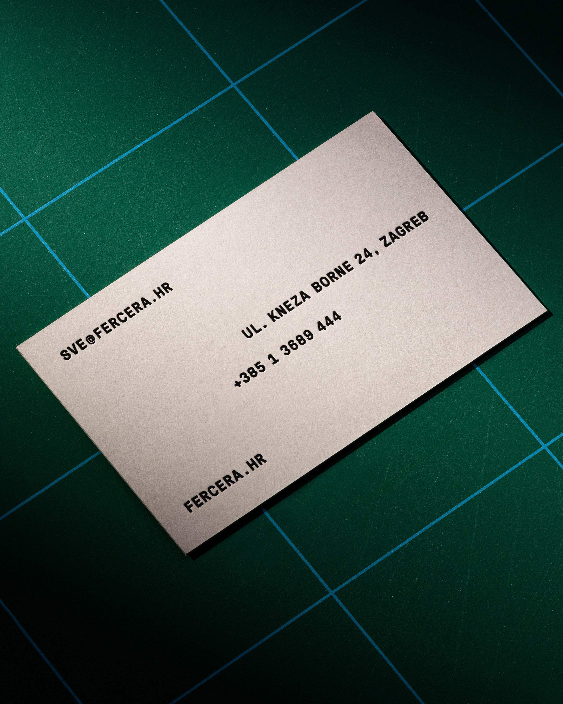
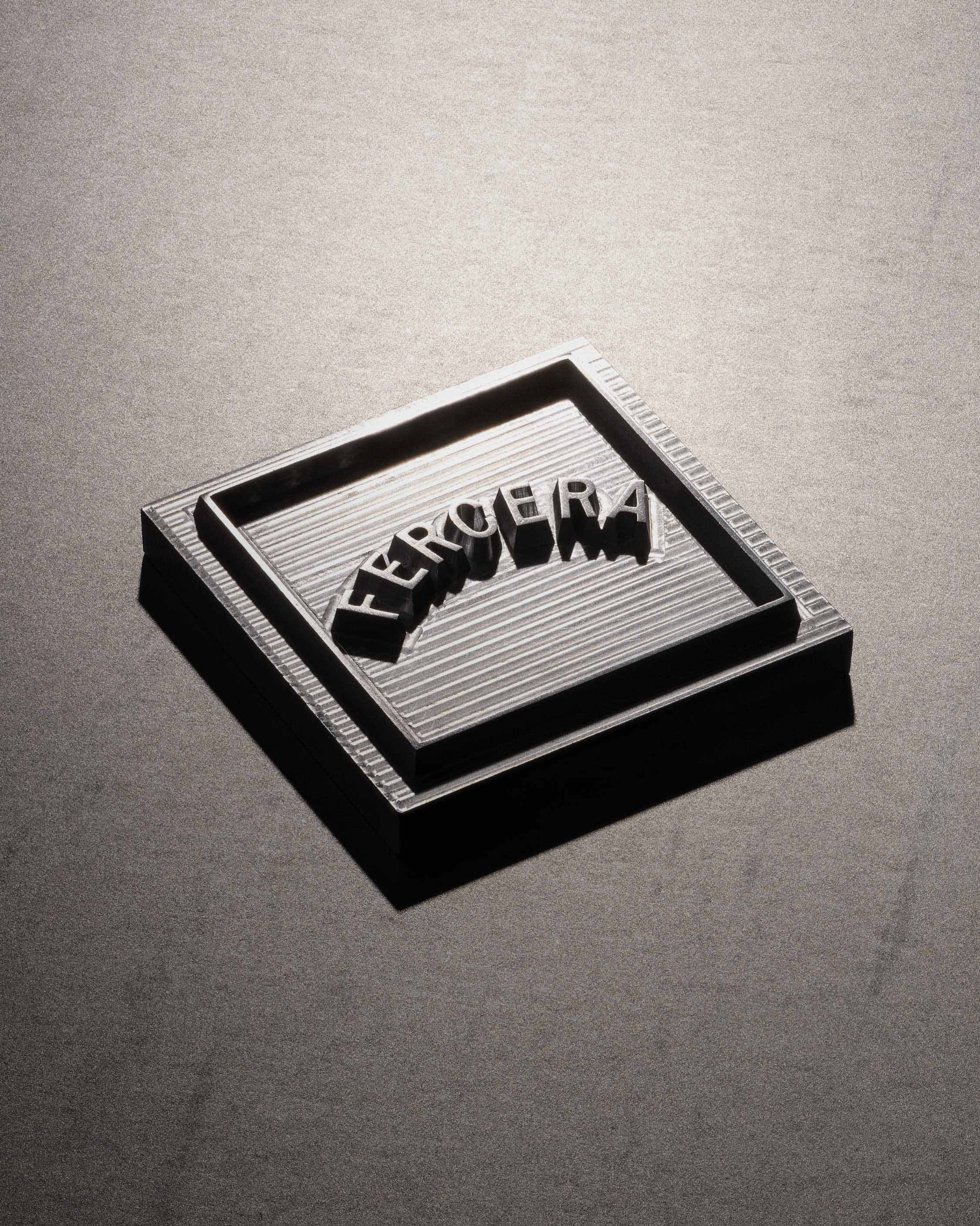
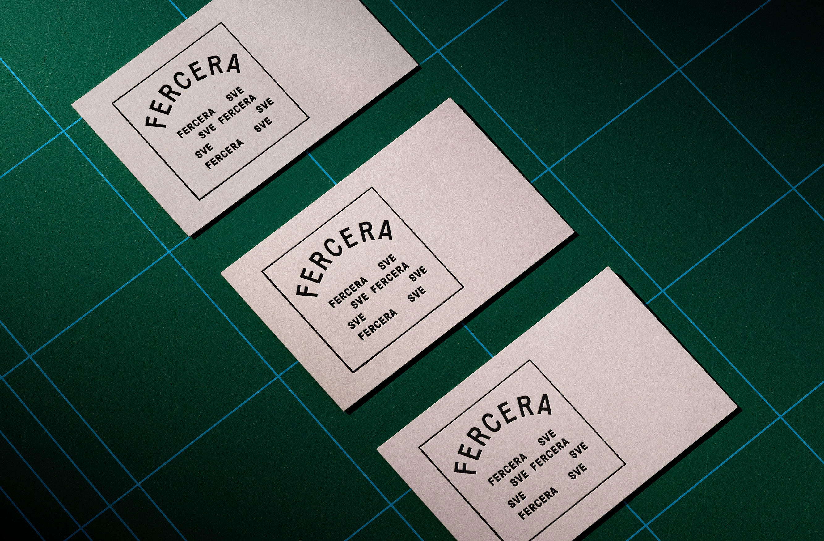
To find a visual common denominator versatile enough to unify very different product categories, we turned to the industrial heritage of condensed grotesk typography that was widely used in Zagreb for store and workshop signage in the early and mid-20th century. This gave Fercera the industrial schmeck that feels contemporary, while remaining locally rooted and relevant.
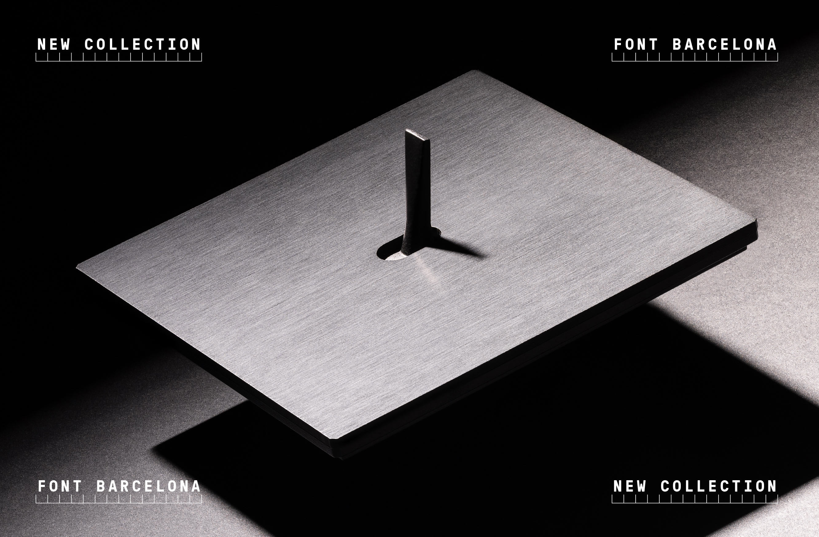
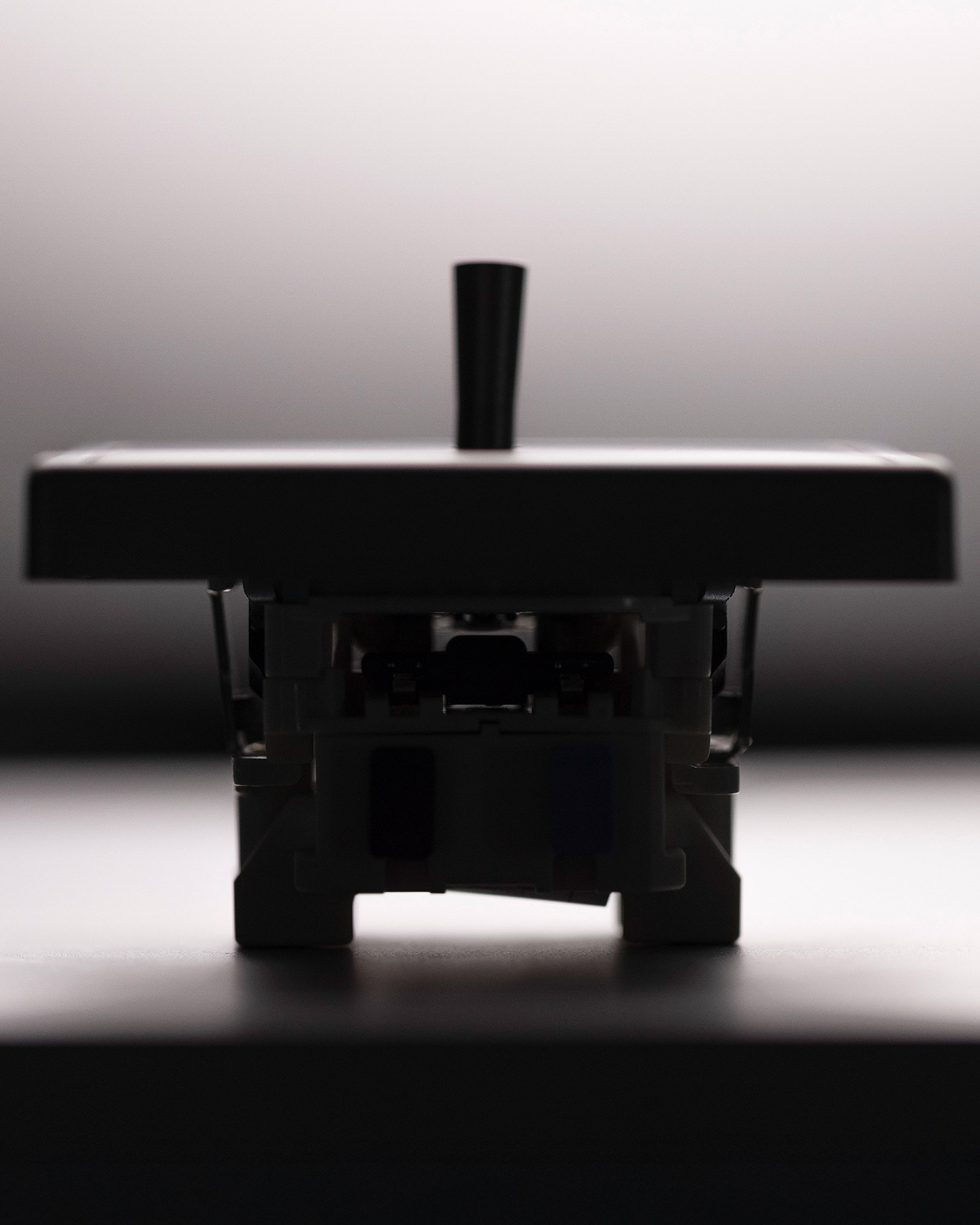
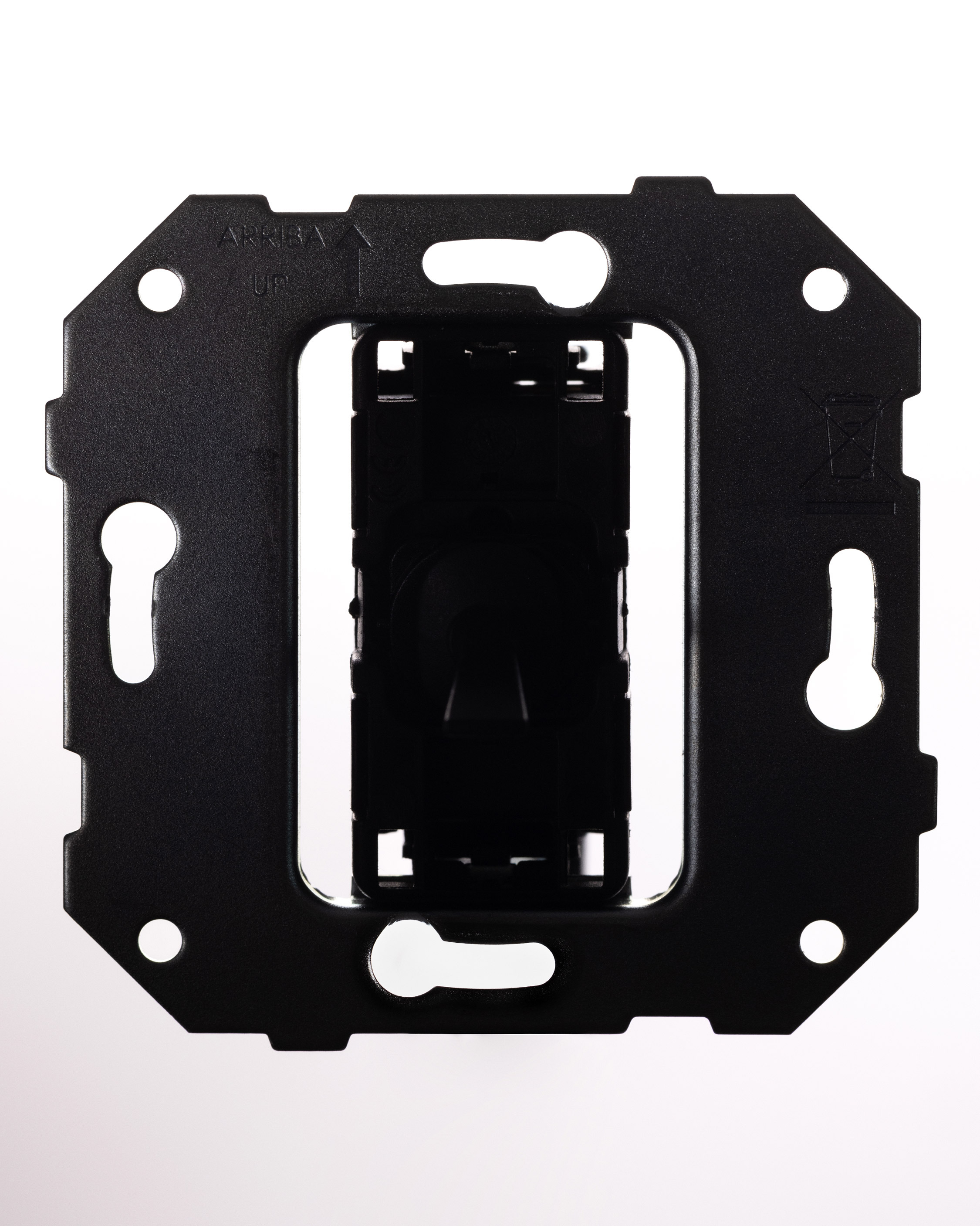
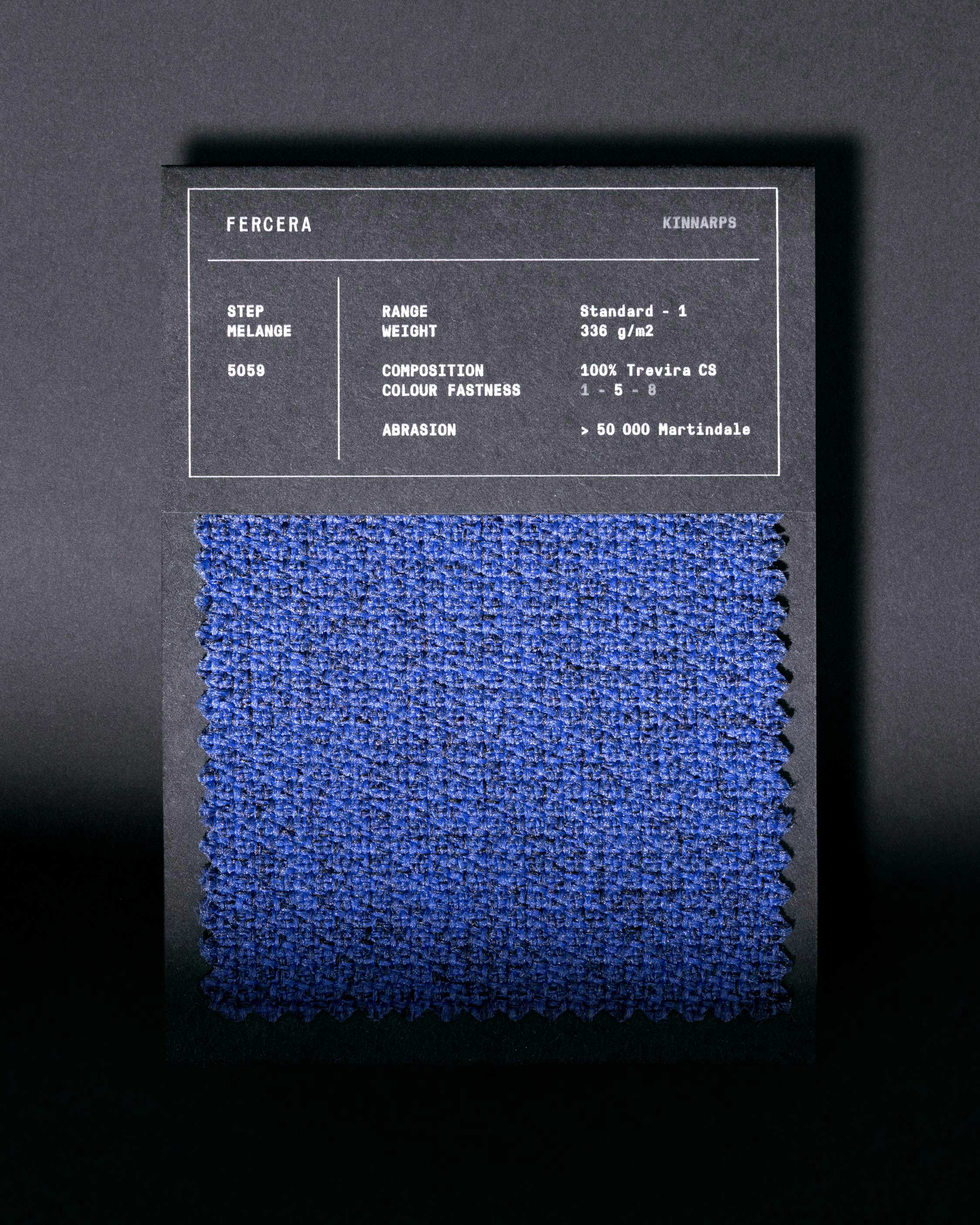


Whether it’s showcasing designer switches, Swedish office furniture, high-end speakers, or espresso machines – everything works seamlessly under Fercera’s visual identity.
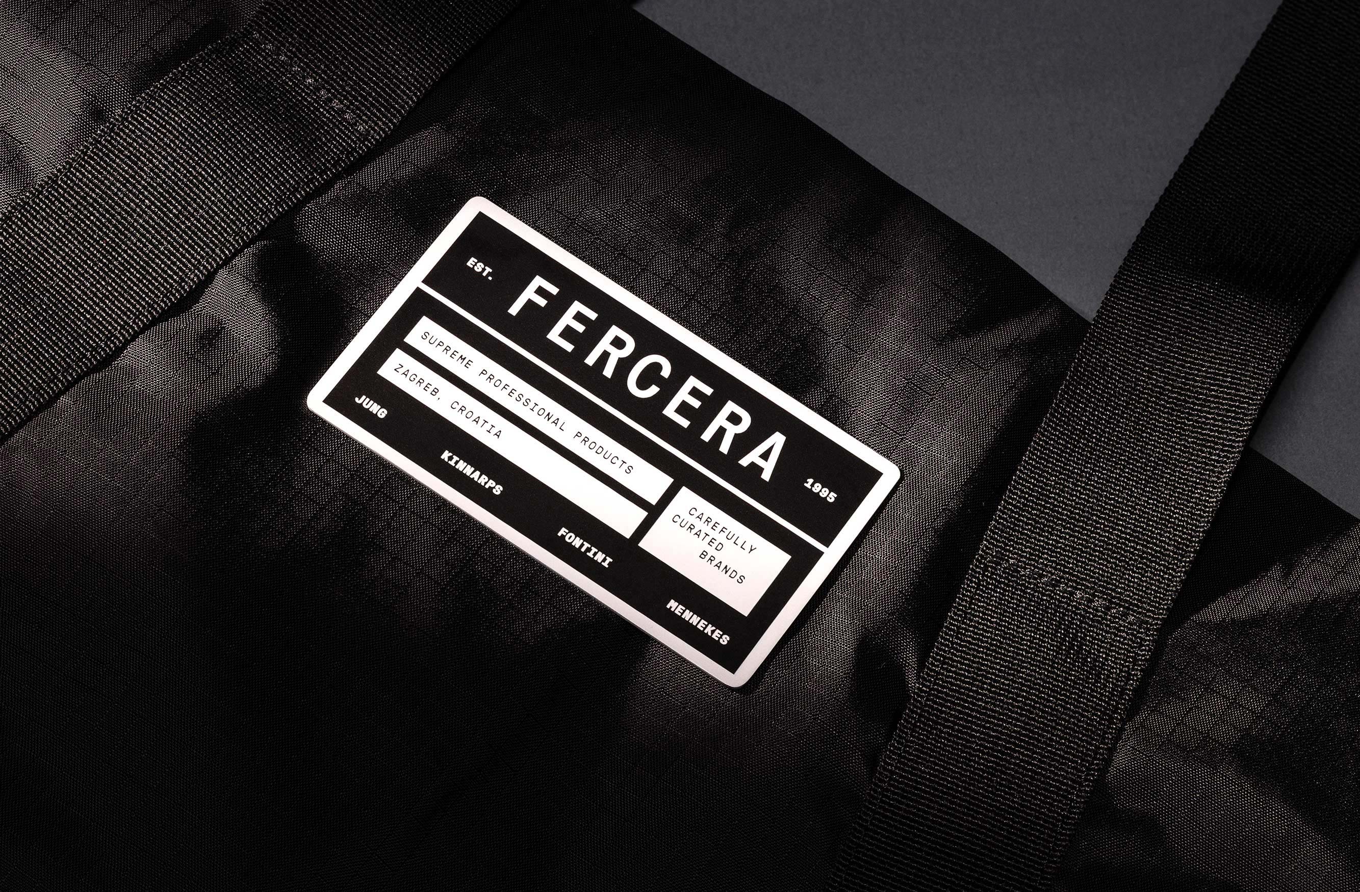
The clean, technical character of the typography and the detail-focused imagery definitely stand out, yet they manage not to stand in the way of spotlighting the brands themselves, one of the main objectives of this rebranding.
Interested in collaborating with us? Send us a message, or mail us at hq@popola.agency