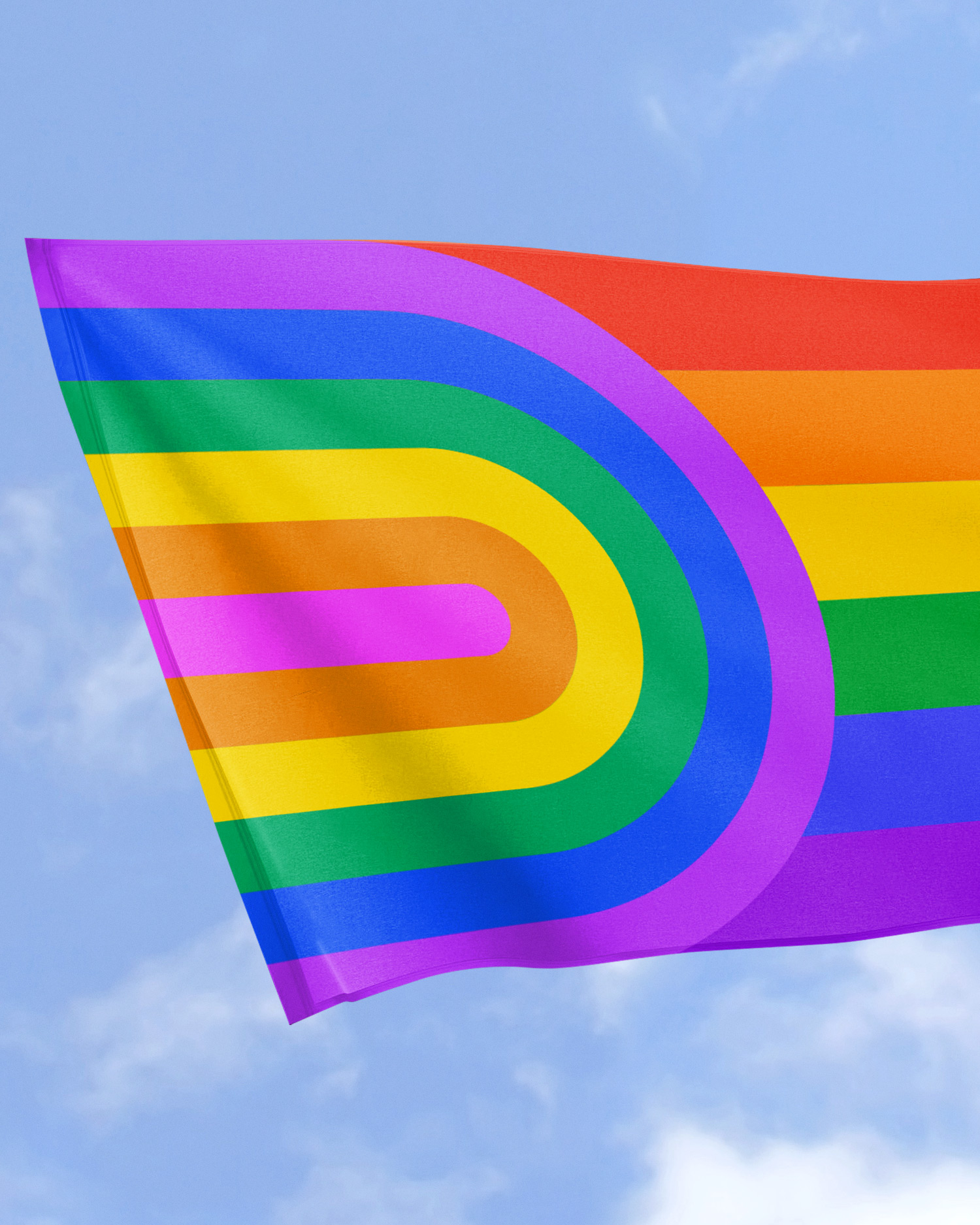
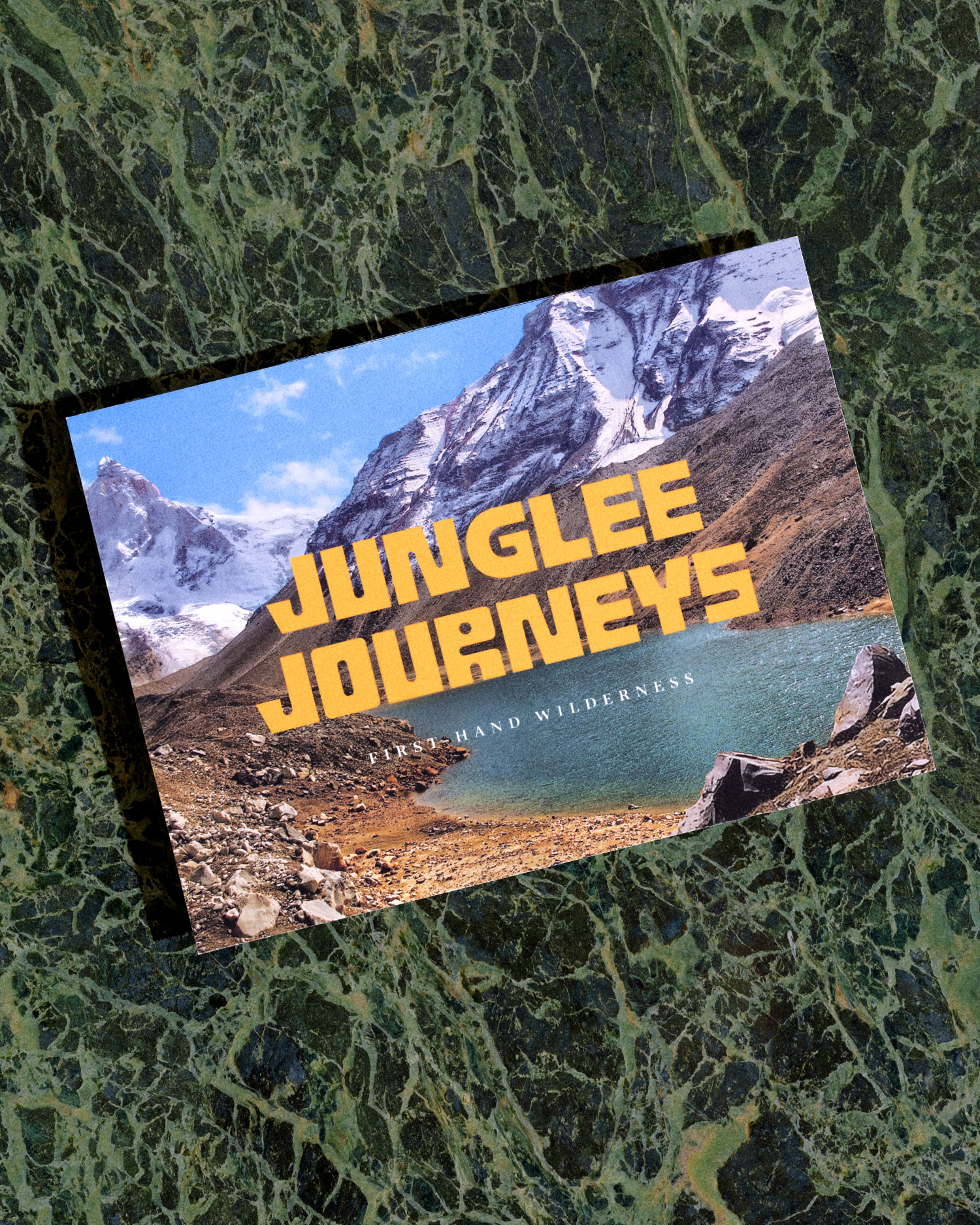
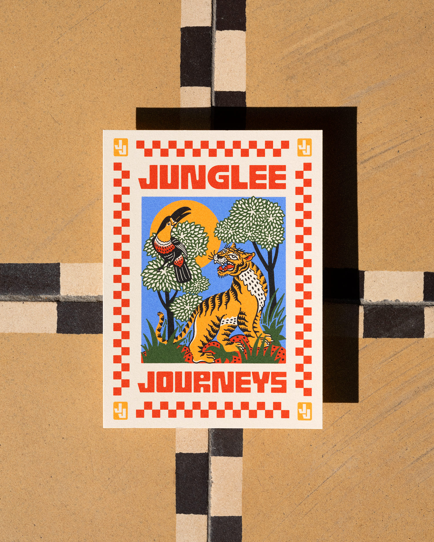
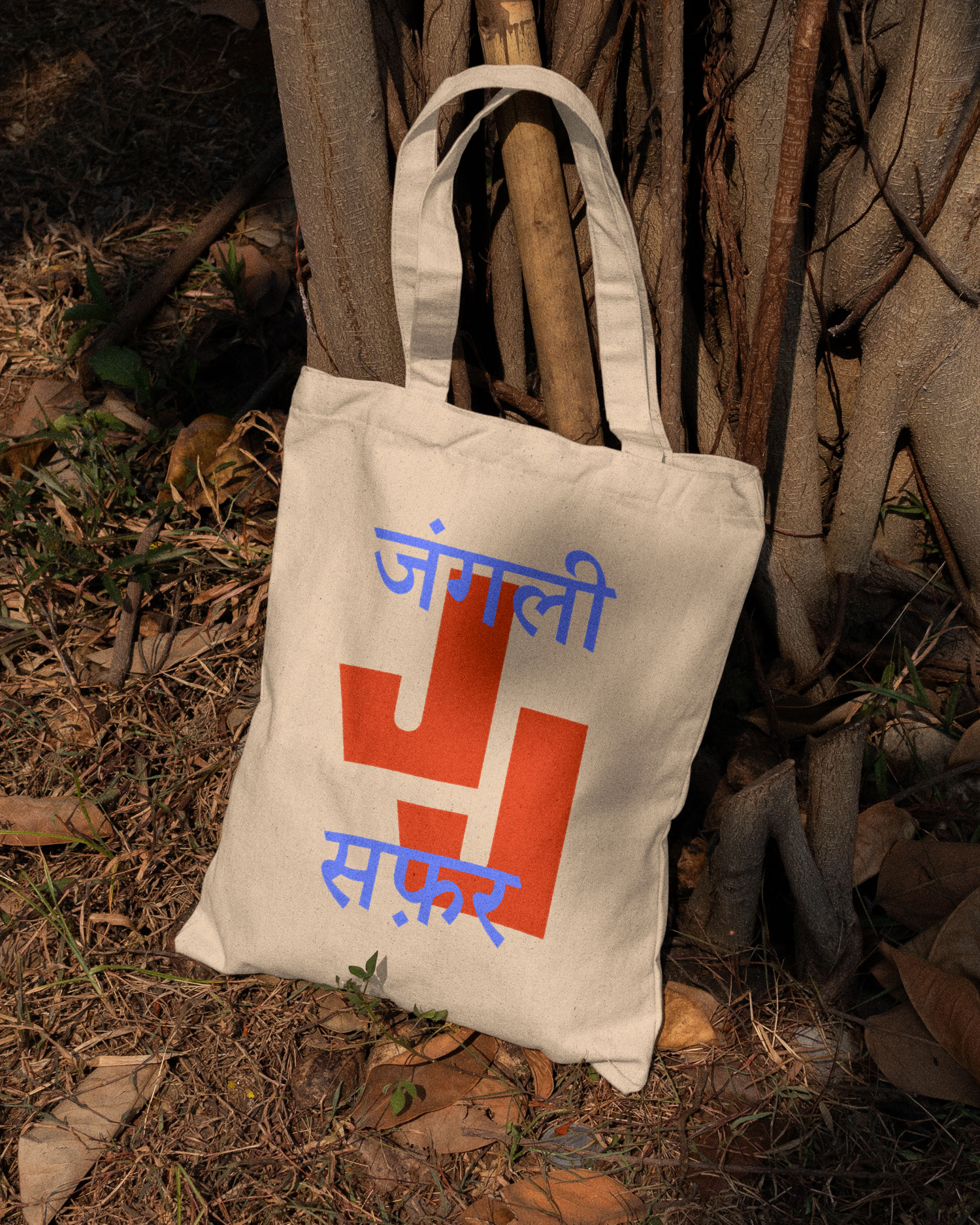
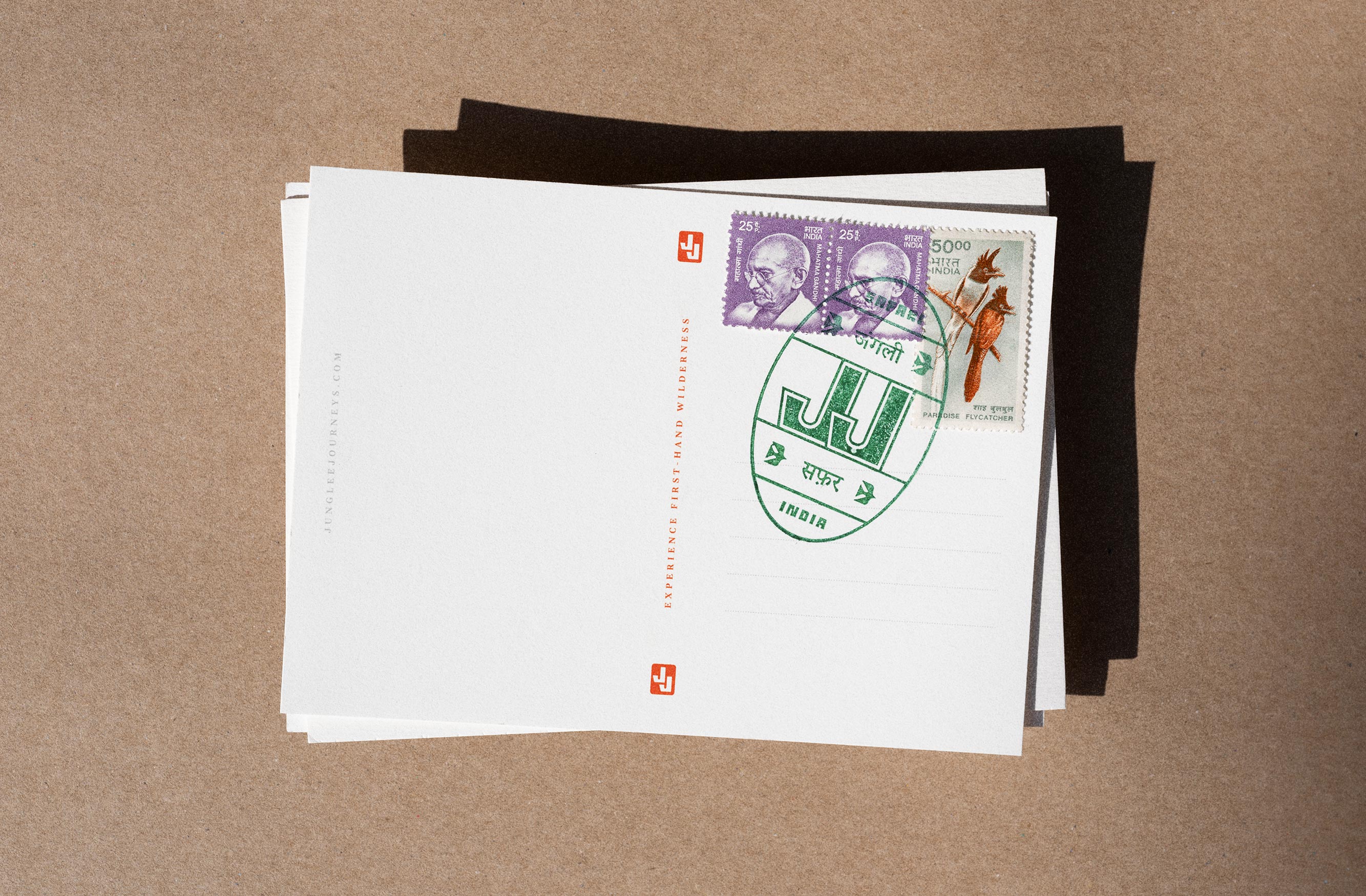
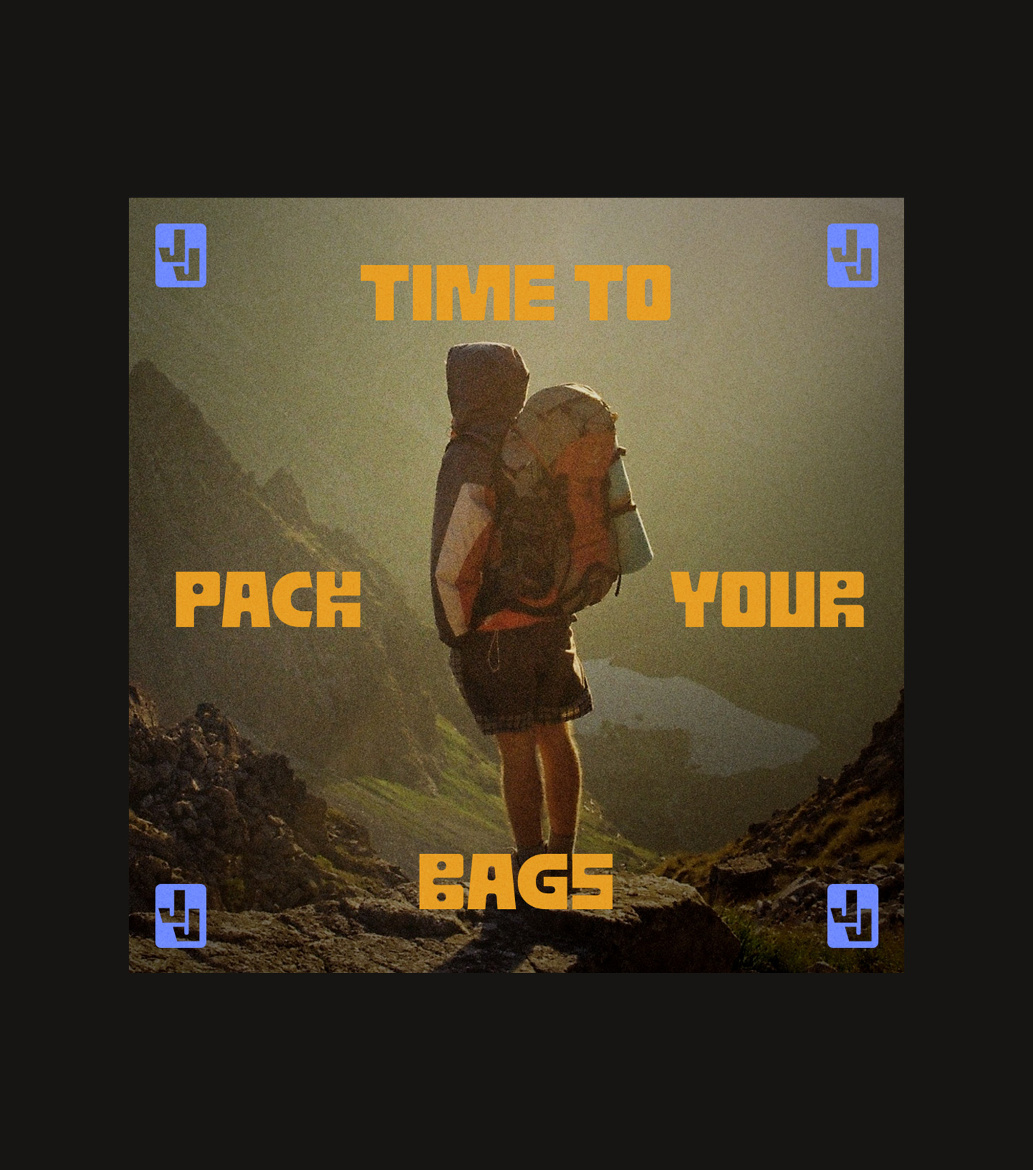
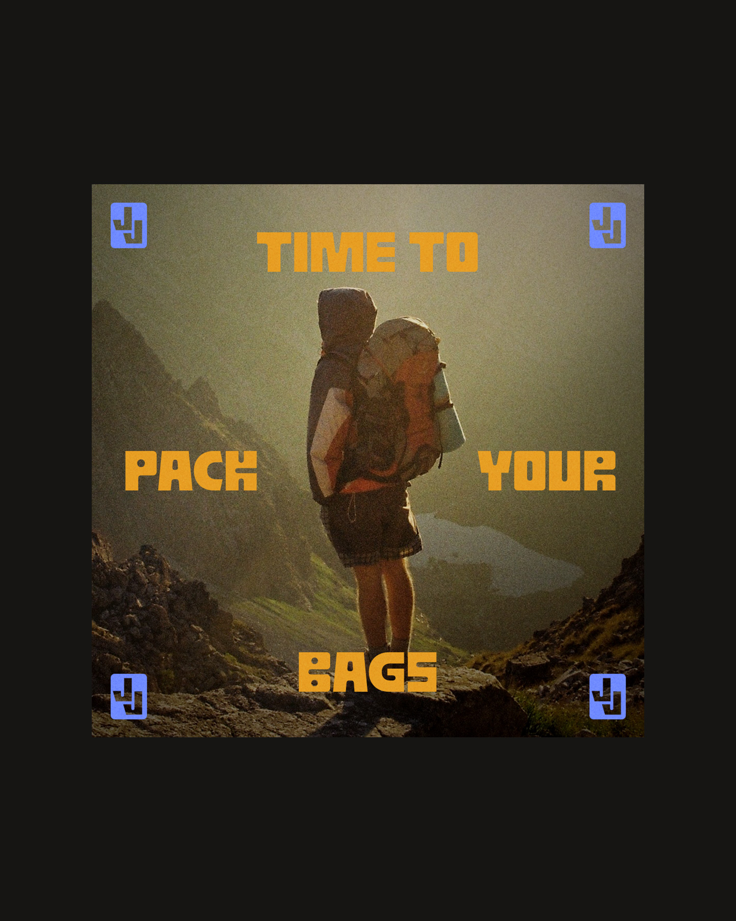
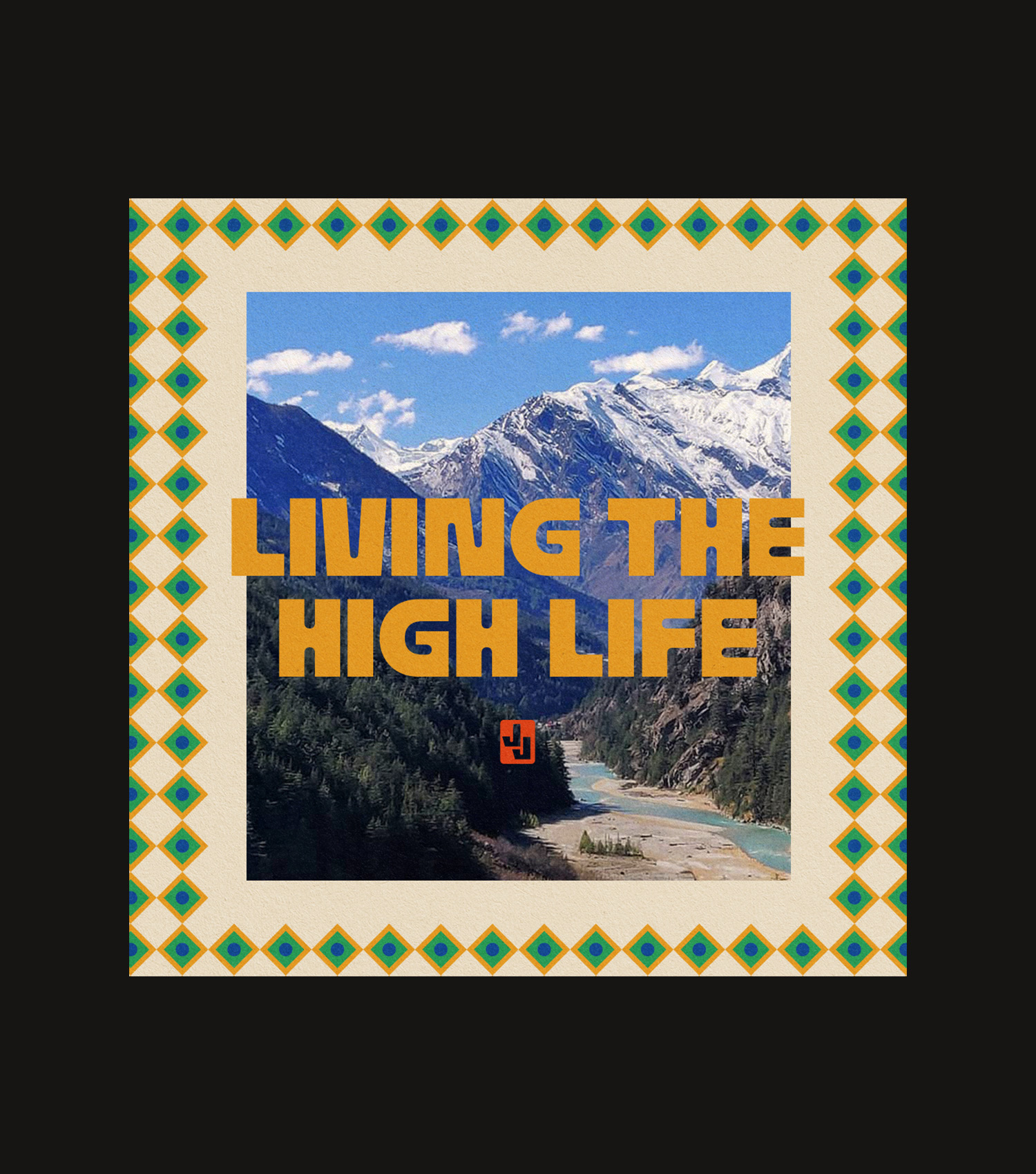
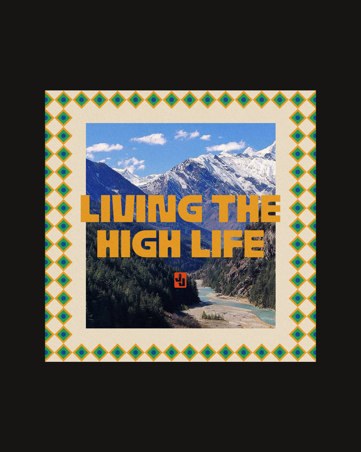
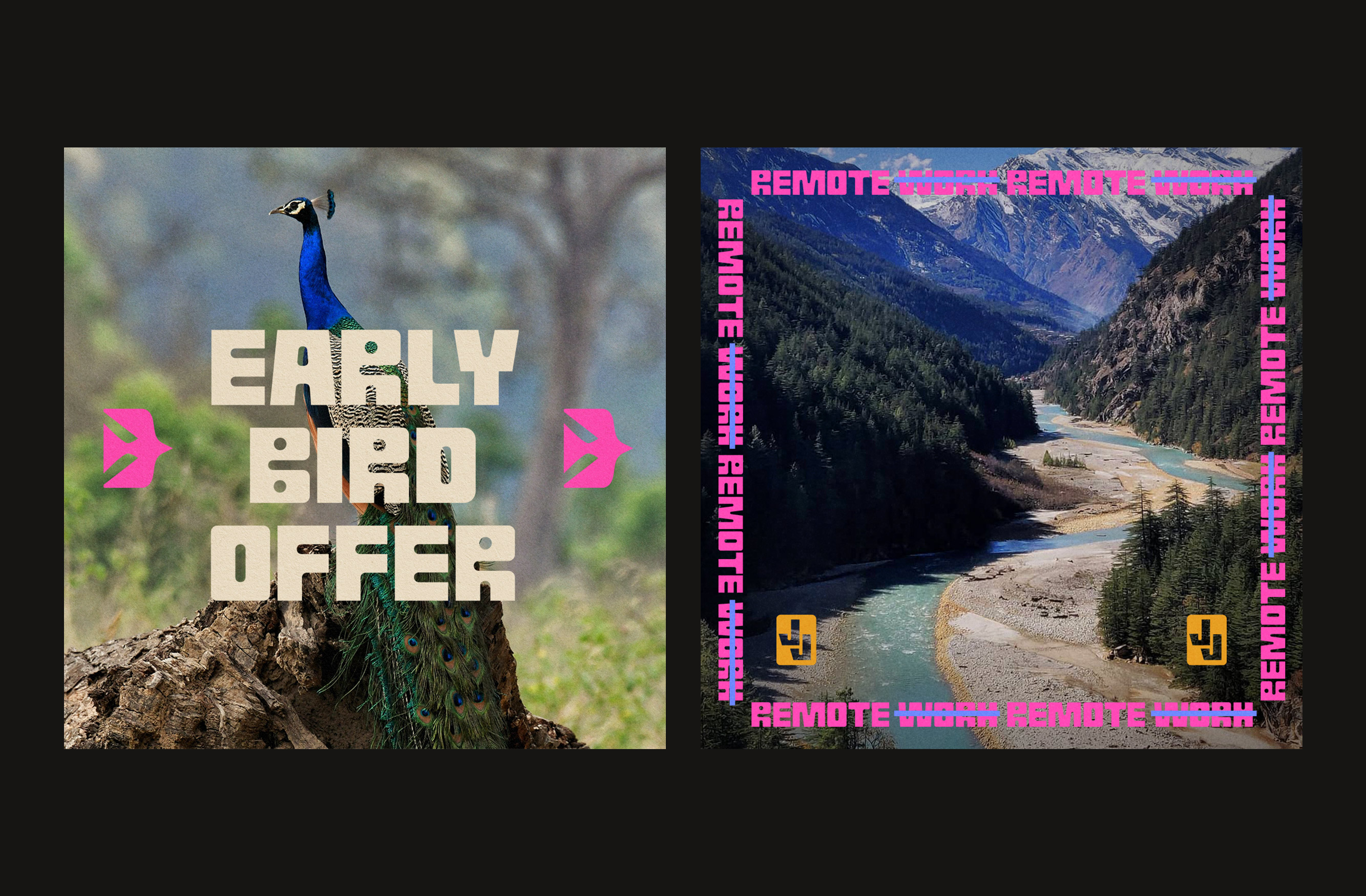
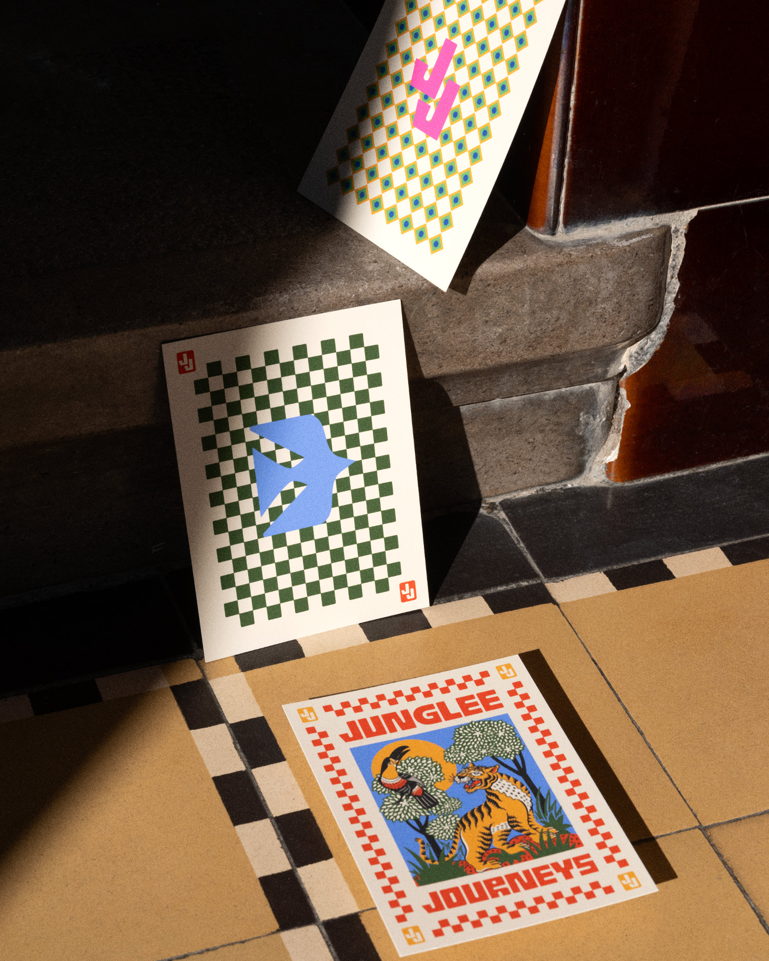
Junglee Journeys is an Indian safari travel agency that offers tailor-made expeditions for curious travelers and adventurers primarily from the UK and Europe. Just like the expeditions themselves, the idea was to make the branding fun, colorful, and captivating – resembling the vast diversity of Indian wildlife and landscapes.
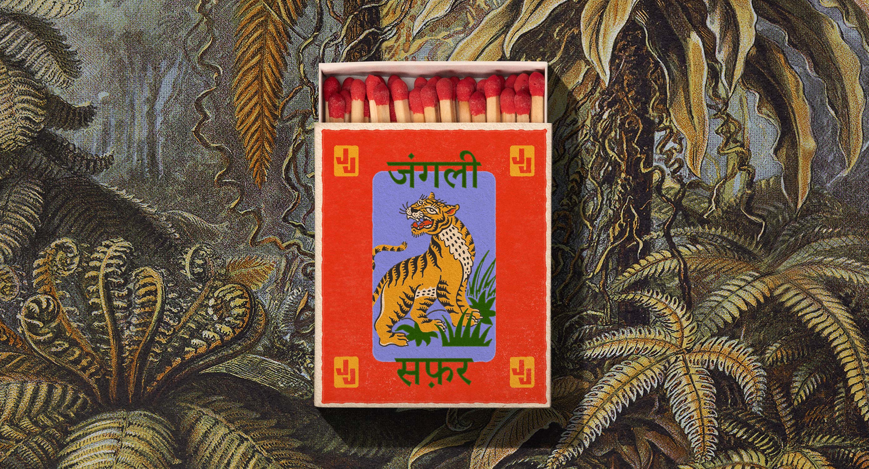
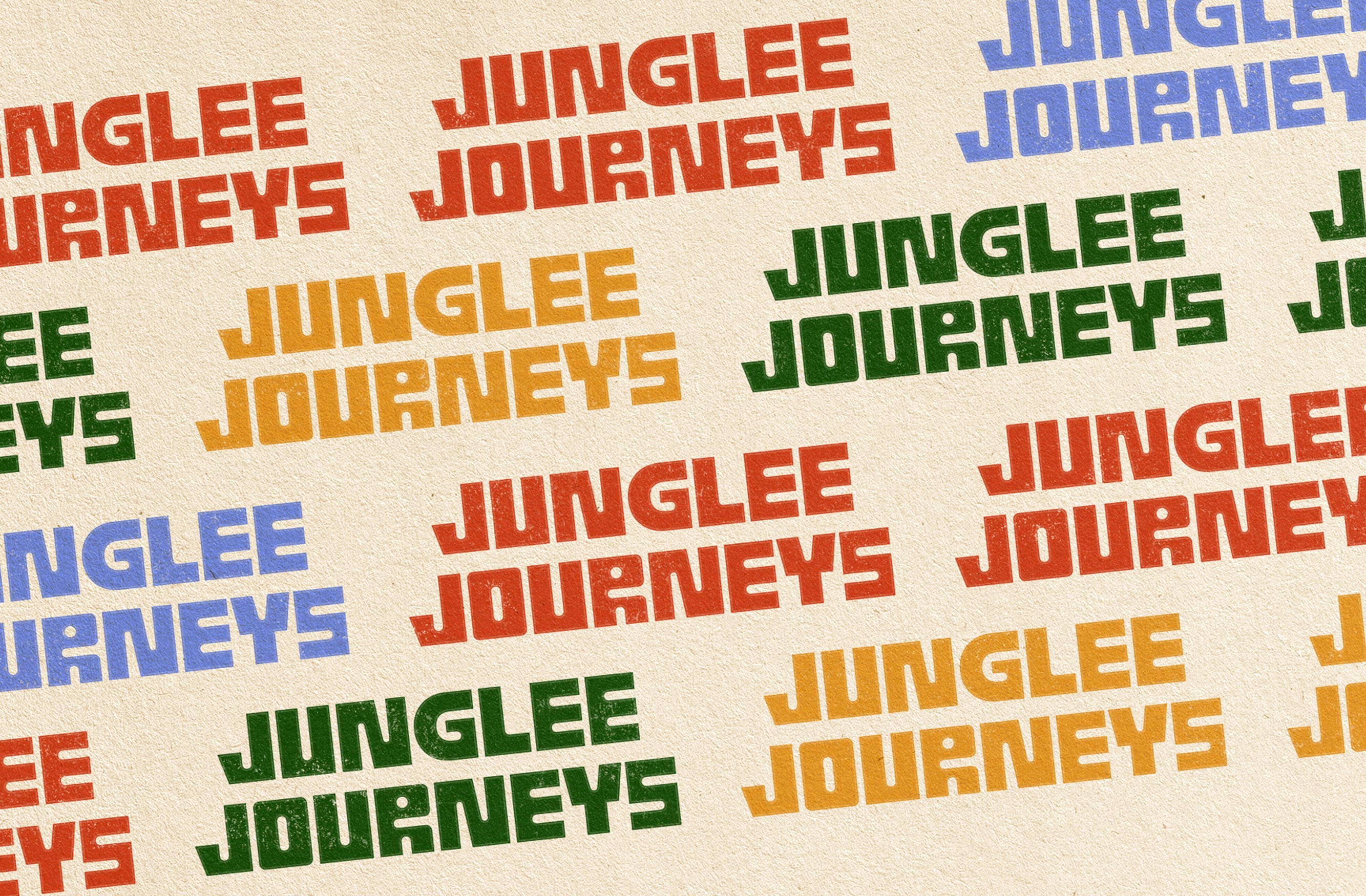
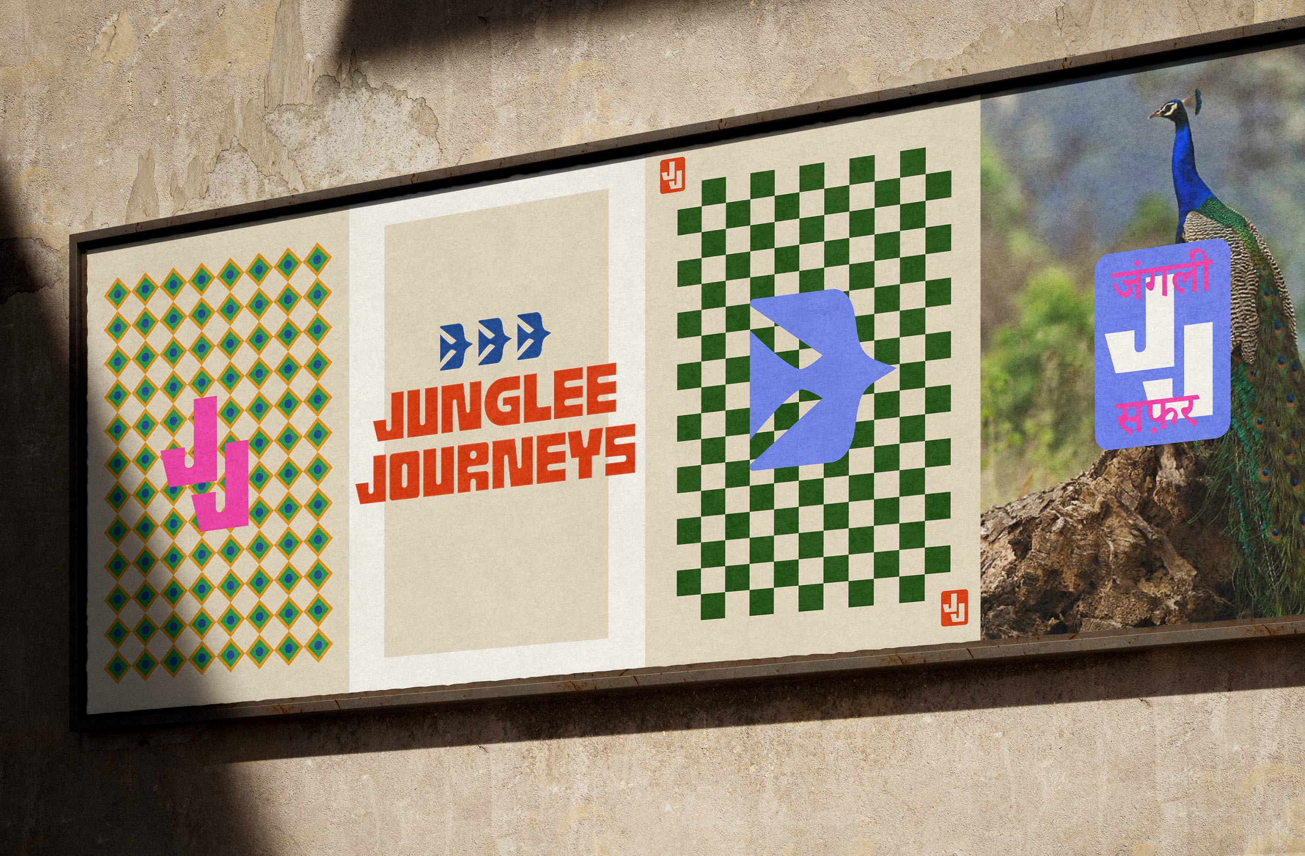
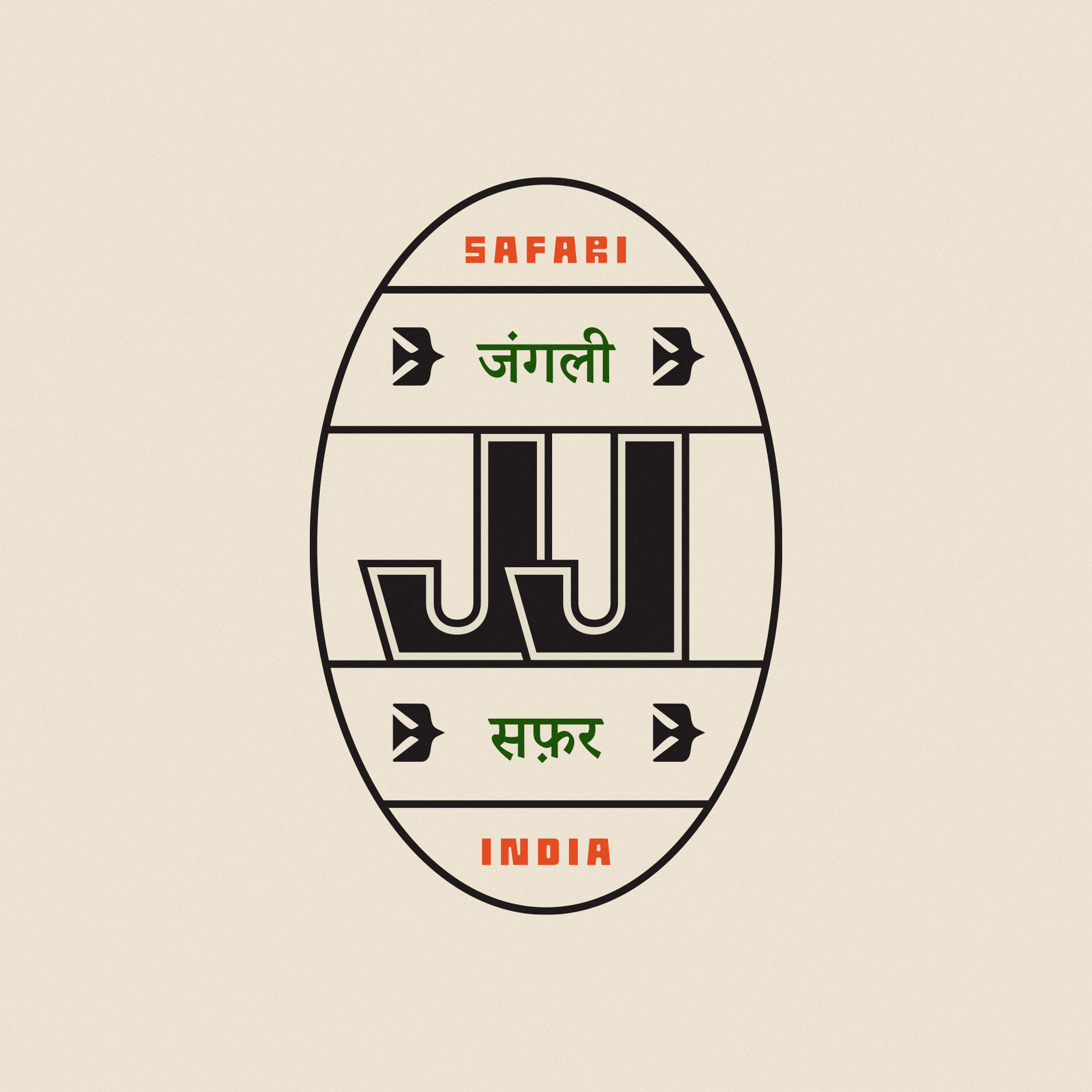
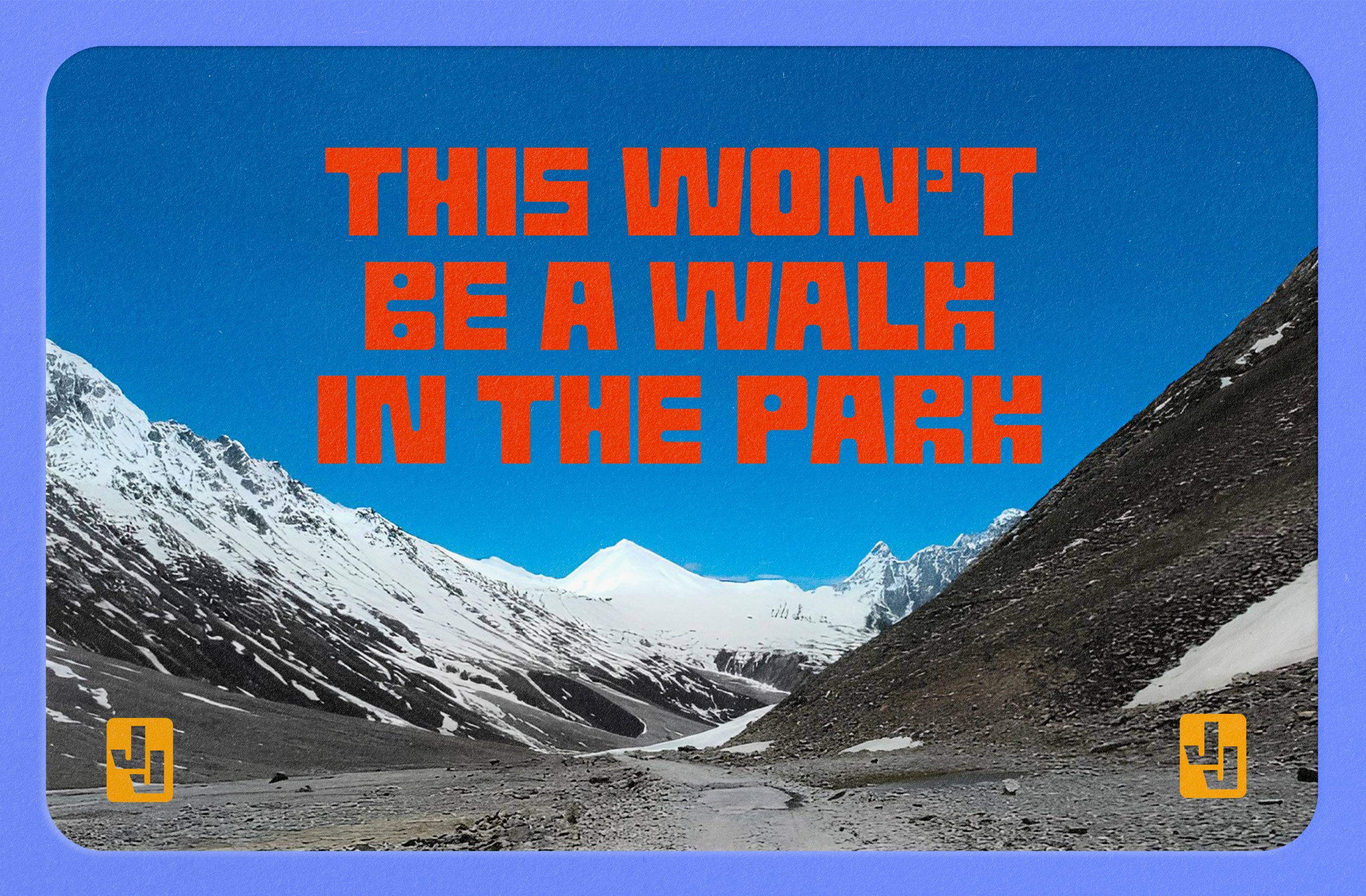
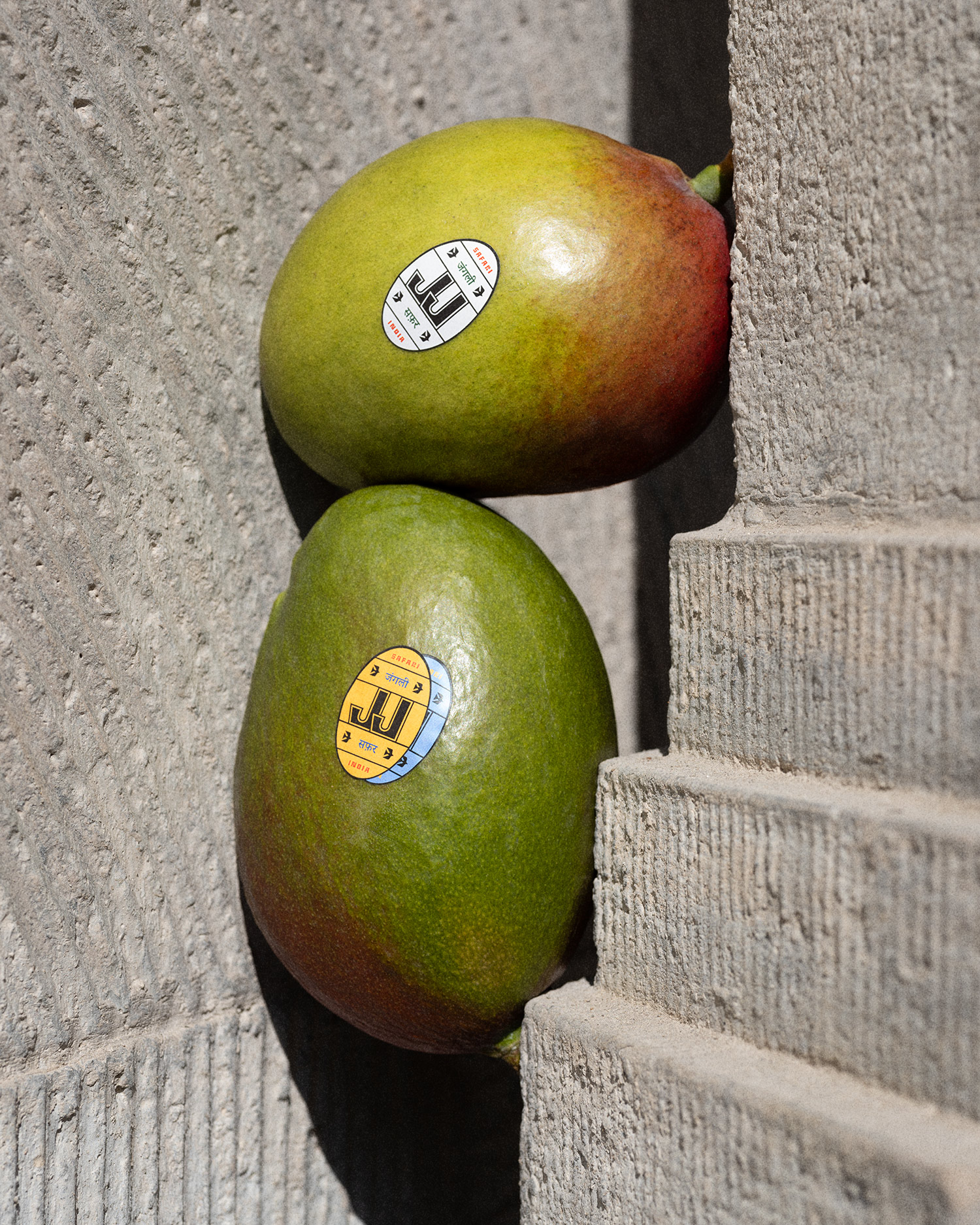
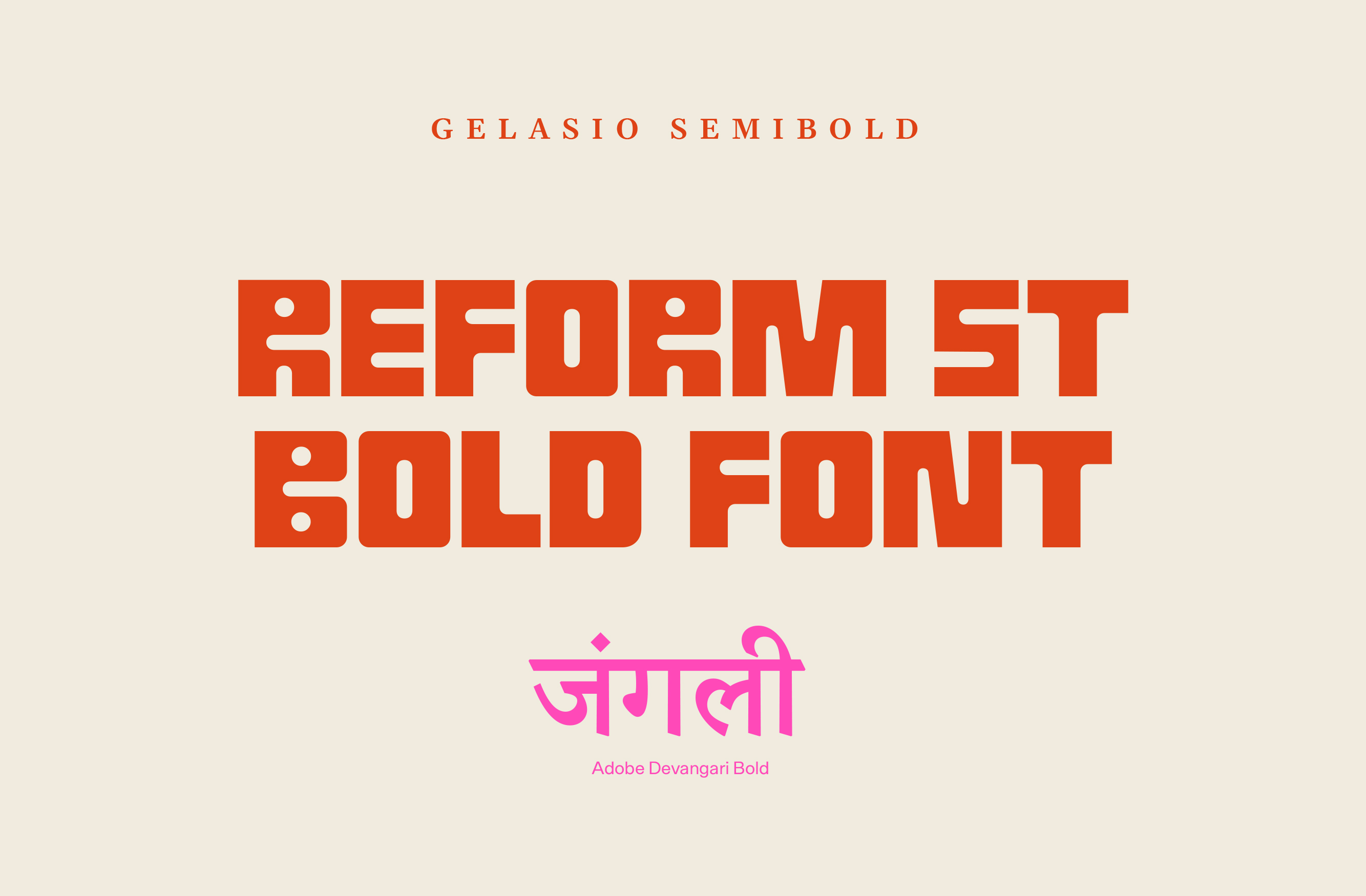
One of the main building blocks of the identity is the typography – the quirky and outdoorsy Reform font – which provided the exciting and lighthearted spirit that was needed. Once we nailed the typography, designing the logo was a walk in the (national) park. So much so, that we designed three different variations: a long-form logotype, an abbreviated JJ logotype and, a stylized, emblem-like version.
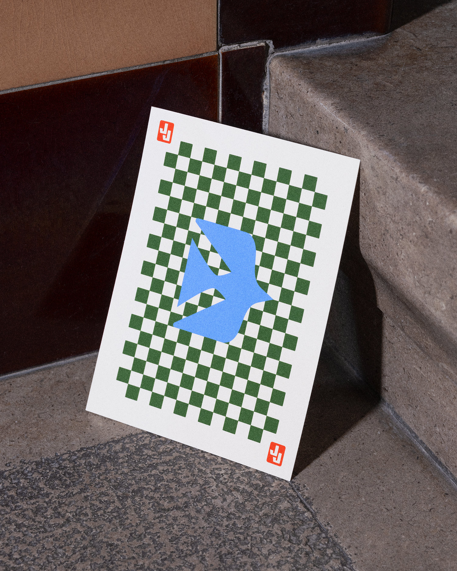


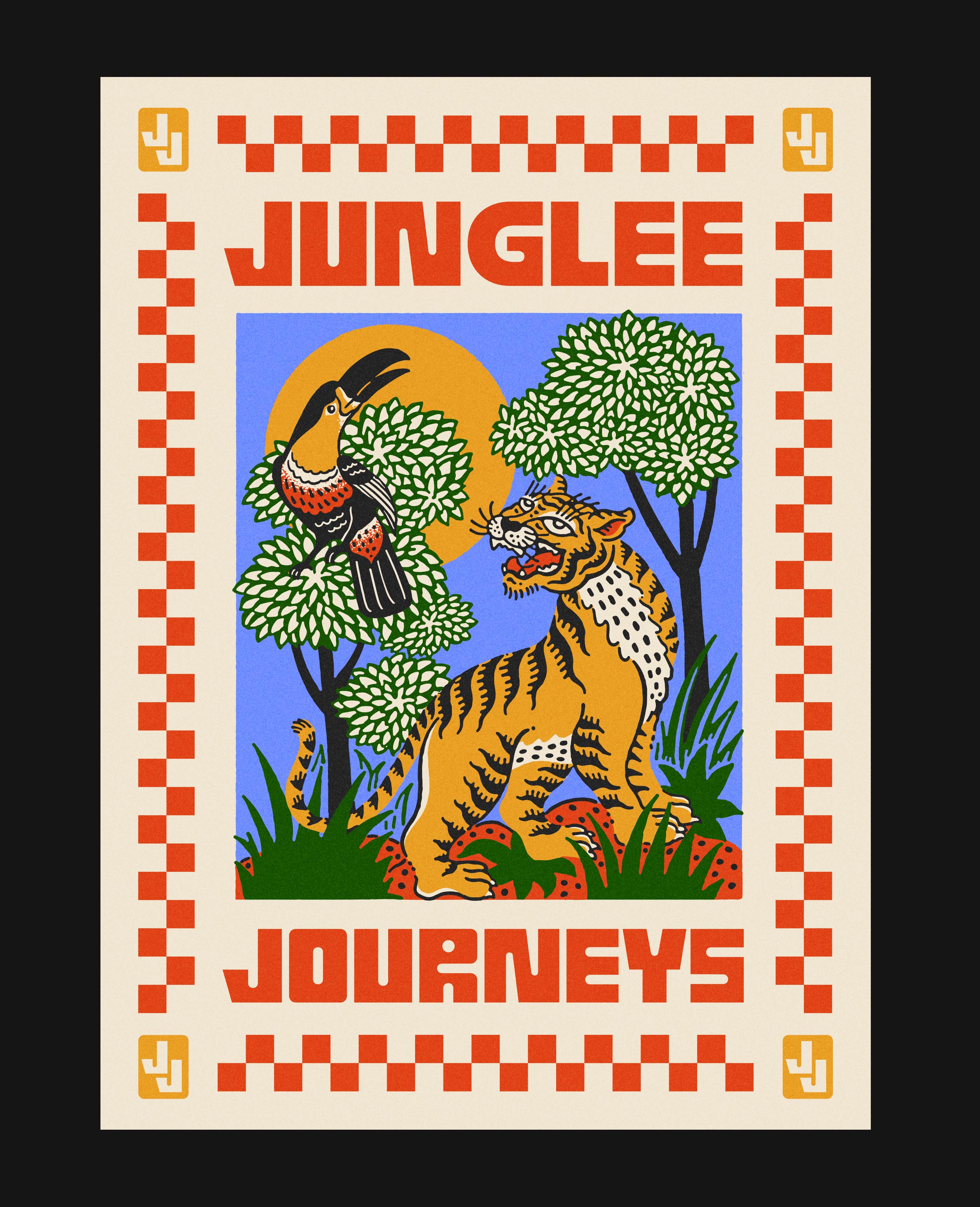
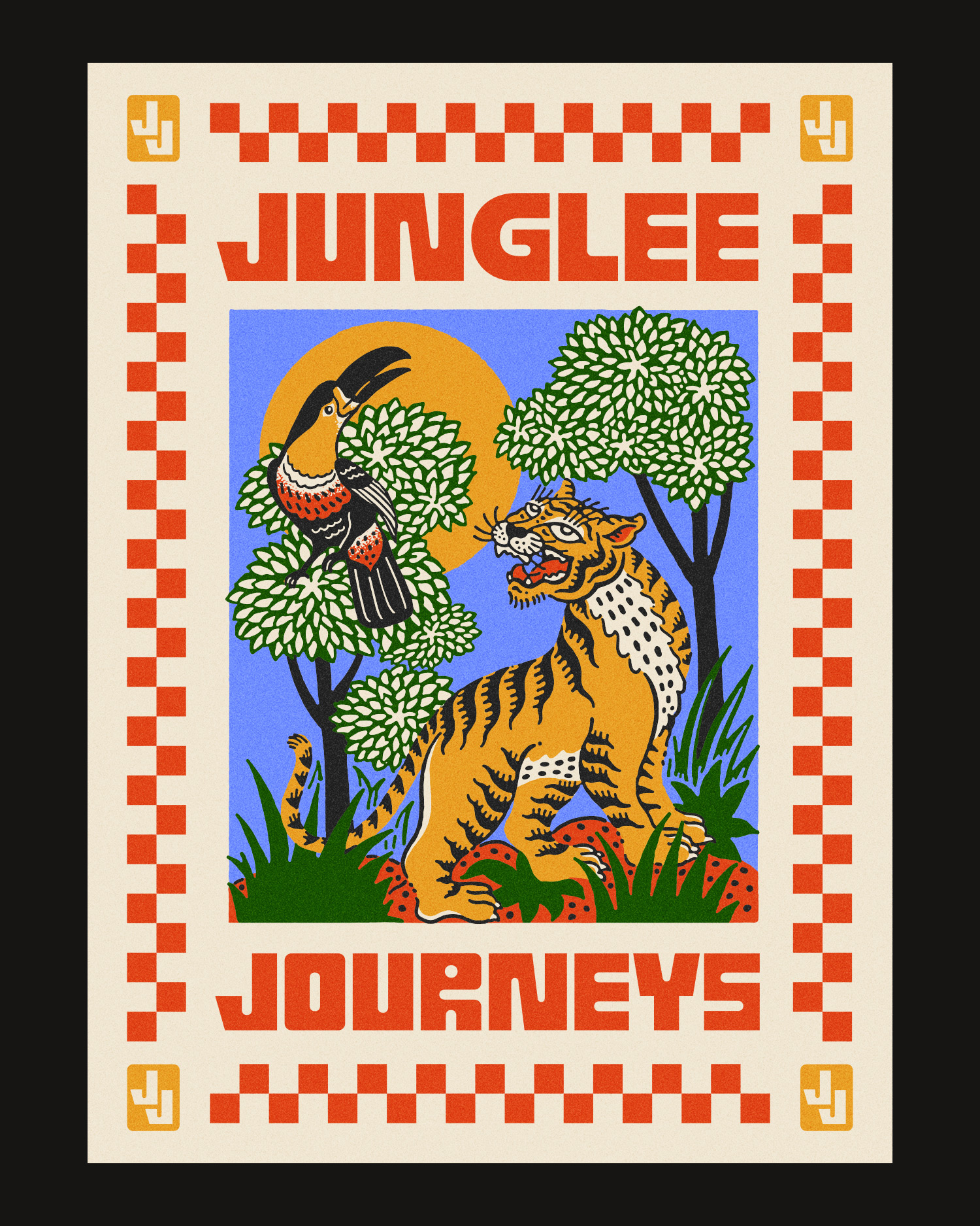
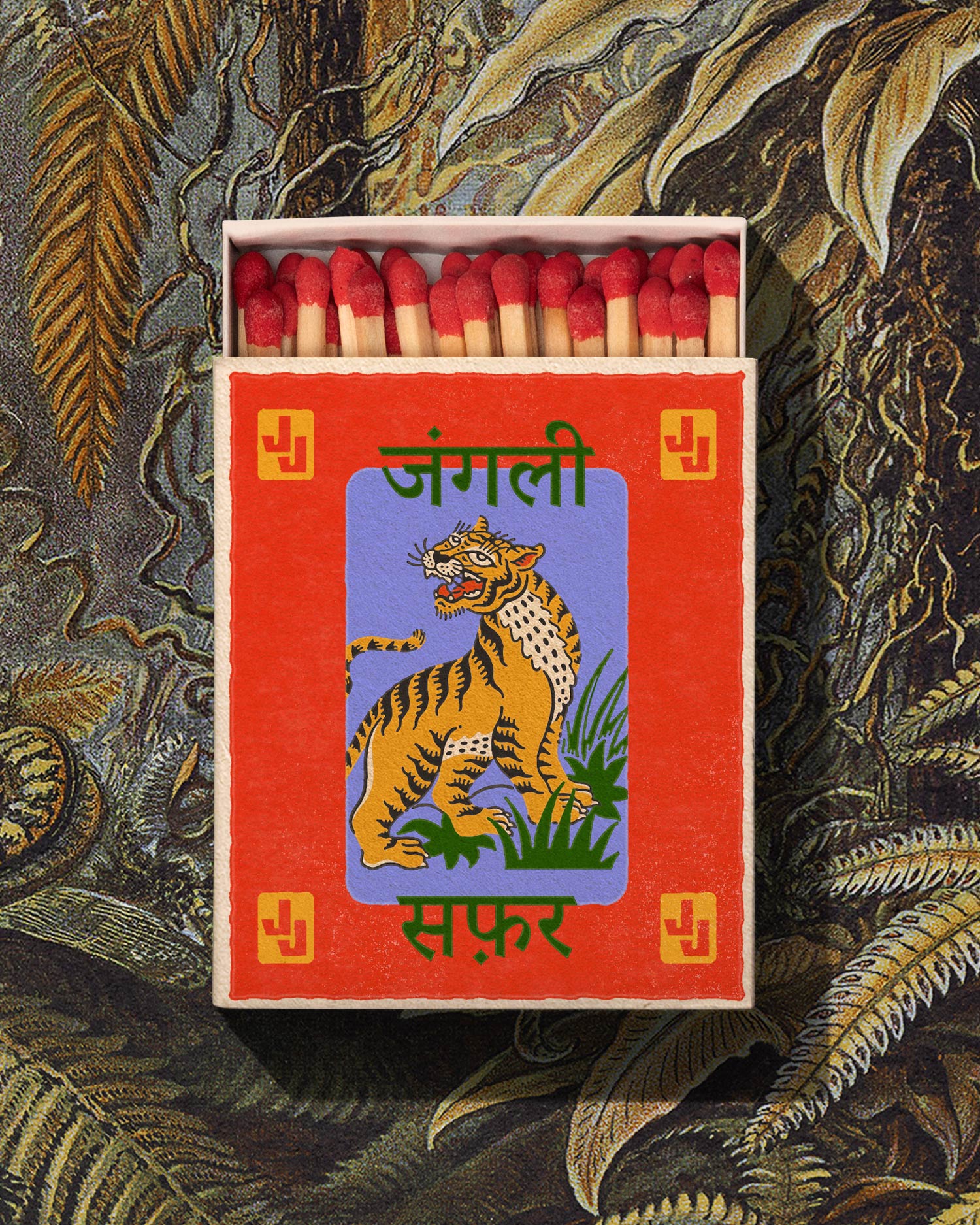
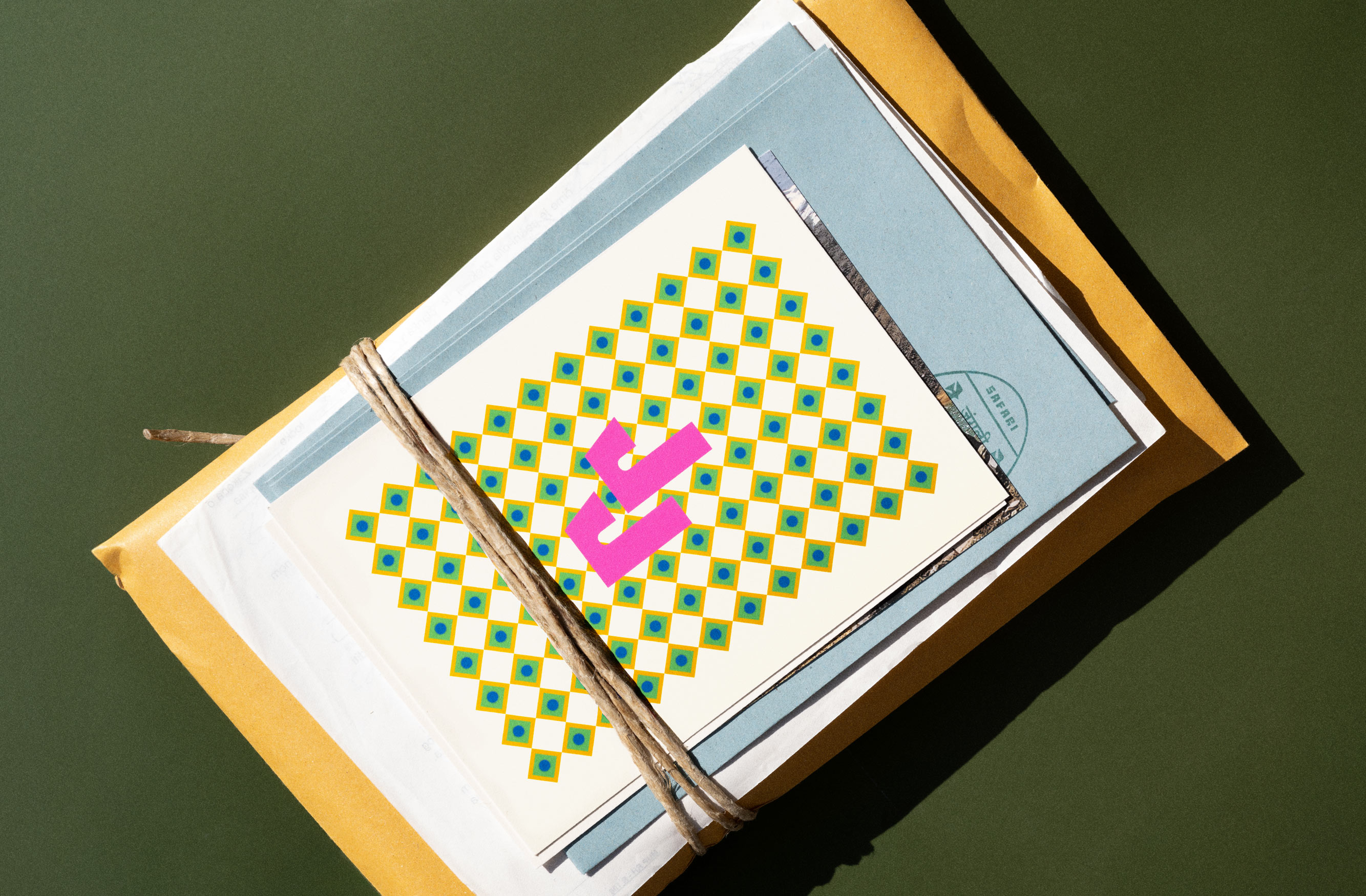
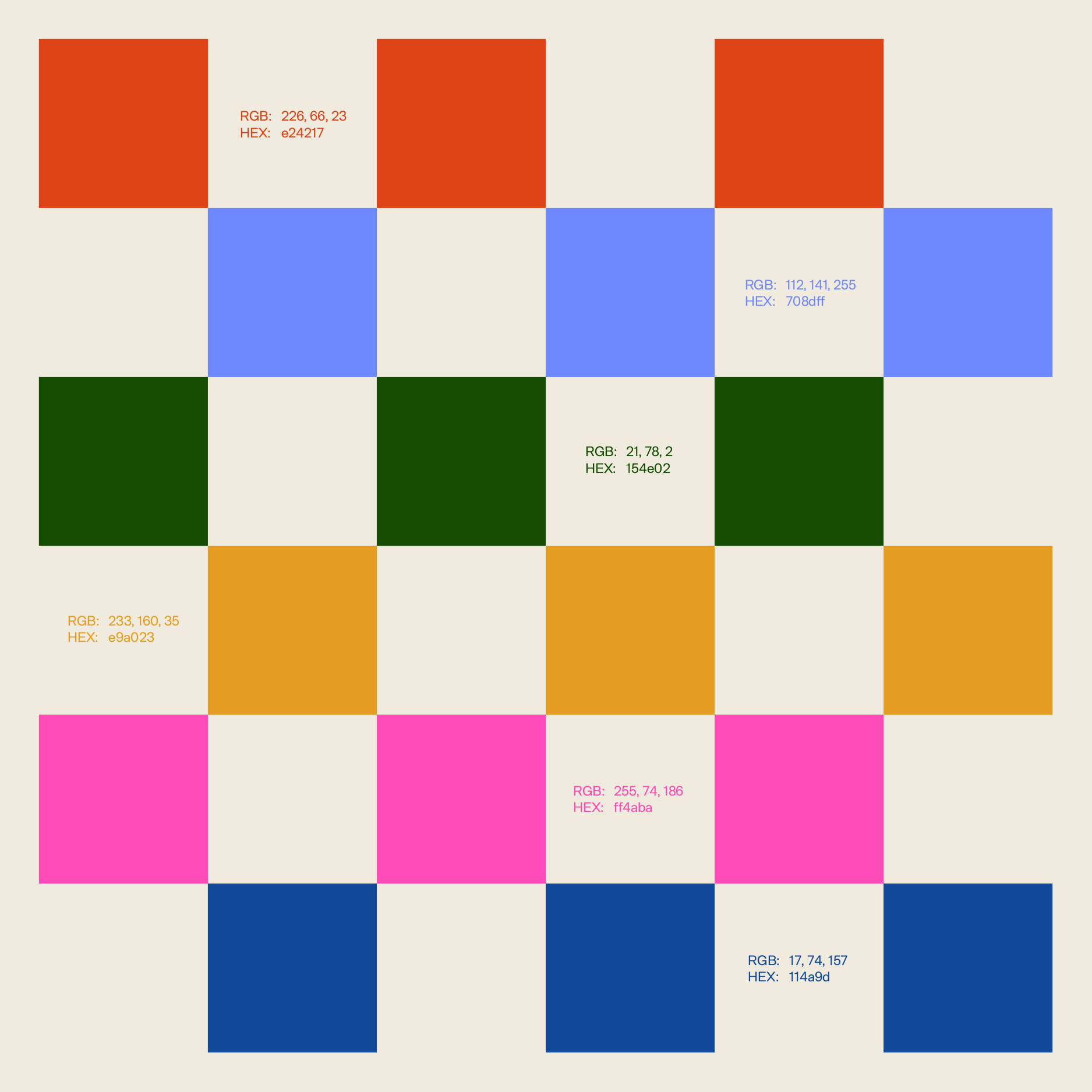
The visual style is inspired by elements of traditional Indian aesthetics like the use of symmetry, repetitive geometric shapes as building blocks and a wide palette of colors, while the illustrations were influenced by the rich heritage of traditional art found on Indian matchboxes.


Interested in collaborating with us? Send us a message, or mail us at hq@popola.agency